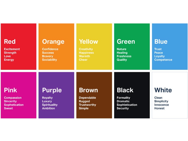
colorChart
Must Watch!
MustWatch
Color Palettes
Colormind
Popular Color Palettes
Color Sets |
| #FBF8F6 |
#B8937C |
#12BBEC |
#D93B6A |
#302E4D |
| #A73604 |
#B3A149 |
#D4CF95 |
#322C05 |
#DEA987 |
| #0C8D7B |
#37BB89 |
#DCBD33 |
#F48735 |
#E44050 |
| #142225 |
#383838 |
#CFD0CD |
#F9F9F1 |
#C7A363 |
| #122041 |
#43AAED |
#C7DED6 |
#B8A182 |
#D85C44 |
| #FBAC65 |
#F0D687 |
#392C1E |
#177586 |
#163339 |
| #FA2512 |
#F39A17 |
#FBC00B |
#8BD927 |
#102F51 |
| #3B1E26 |
#2A5D7E |
#0CA8D8 |
#5CB7DD |
#EFE1D0 |
Green Colors |
| #ADFF2F |
#7FFF00 |
#7CFC00 |
#00FF00 |
#32CD32 |
#98FB98 |
#90EE90 |
| #009F00 |
#20AF20 |
#40BF40 |
#60CF60 |
#80DF80 |
#a0EFa0 |
#c0FFc0 |
#e0FFe0 |
| #009F00 |
#00AF20 |
#00BF40 |
#00CF60 |
#00DF80 |
#00EFa0 |
#00FFc0 |
#00FFe0 |
| #00FA9A |
#00FF7F |
#3CB371 |
#2E8B57 |
#228B22 |
#008000 |
#006400 |
| #9ACD32 |
#6B8E23 |
#556B2F |
#66CDAA |
#8FBC8F |
#20B2AA |
#008B8B |
#008080 |
| #001000 |
#002000 |
#003000 |
#004000 |
#005000 |
#006000 |
#007000 |
#008000 |
#008000 |
Cyan Colors |
| #00FFFF |
#00FFFF |
#E0FFFF |
#AFEEEE |
#7FFFD4 |
#40E0D0 |
#48D1CC |
#00CED1 |
| #00FFFF |
#10FFFF |
#20FFFF |
#30FFFF |
#40FFFF |
#50FFFF |
#60FFFF |
#70FFFF |
| #000FFF |
#102FFF |
#204FFF |
#306FFF |
#408FFF |
#50aFFF |
#60cFFF |
#70eFFF |
Blue Colors |
| #5F9EA0 |
#4682B4 |
#B0C4DE |
#ADD8E6 |
#B0E0E6 |
#87CEFA |
#87CEEB |
#6495ED |
| #00BFFF |
#1E90FF |
#4169E1 |
#0000FF |
#0000CD |
#00008B |
#000080 |
#191970 |
| #2020FF |
#2020FF |
#3030FF |
#4040FF |
#5050FF |
#6060FF |
#7070FF |
#8080FF |
| #000010 |
#000020 |
#000030 |
#000040 |
#000050 |
#000060 |
#000070 |
#000080 |
#000080 |
Pink Colors |
| #FFC0CB |
#FFB6C1 |
#FF69B4 |
#FF1493 |
#DB7093 |
#C71585 |
Purple Colors |
| #E6E6FA |
#D8BFD8 |
#DDA0DD |
#DA70D6 |
#EE82EE |
#FF00FF |
#FF00FF |
| #BA55D3 |
#9932CC |
#9400D3 |
#8A2BE2 |
#8B008B |
#800080 |
#9370DB |
| #7B68EE |
#6A5ACD |
#483D8B |
#663399 |
#4B0082 |
Red Colors |
| #FFA07A |
#FA8072 |
#E9967A |
#F08080 |
#CD5C5C |
#DC143C |
#FF0000 |
#B22222 |
#8B0000 |
| #100000 |
#200000 |
#300000 |
#400000 |
#500000 |
#600000 |
#700000 |
#800000 |
#800000 |
Orange Colors |
| #FFA500 |
#FF8C00 |
#FF7F50 |
#FF6347 |
#FF4500 |
Yellow Colors |
| #FFD700 |
#FFFF00 |
#FFFFE0 |
#FFFACD |
#FAFAD2 |
| #FFEFD5 |
#FFE4B5 |
#FFDAB9 |
#EEE8AA |
#F0E68C |
#BDB76B |
Brown Colors |
| #FFF8DC |
#FFEBCD |
#FFE4C4 |
#FFDEAD |
#F5DEB3 |
#DEB887 |
#D2B48C |
#BC8F8F |
#F4A460 |
| #DAA520 |
#B8860B |
#CD853F |
#D2691E |
#808000 |
#8B4513 |
#A0522D |
#A52A2A |
#800000 |
White Colors |
| #FFFFFF |
#FFFAFA |
#F0FFF0 |
#F5FFFA |
#F0FFFF |
#F0F8FF |
#F8F8FF |
#F5F5F5 |
| #FFF5EE |
#F5F5DC |
#FDF5E6 |
#FFFAF0 |
#FFFFF0 |
#FAEBD7 |
#FAF0E6 |
#FFF0F5 |
#FFE4E1 |
Grey Colors |
| #DCDCDC |
#D3D3D3 |
#C0C0C0 |
#A9A9A9 |
#696969 |
| #808080 |
#778899 |
#708090 |
#2F4F4F |
#000000 |
color combinations pattern
Pink and raisin
Hex code: #e52165 and #0d1137
Red, sea-foam, jade and violet
Hex code: #d72631, #a2d5c6, #077b8a and #5c3c92
Yellow, magenta, cyan and black
Hex code: #e2d810, #d9138a, #12a4d9 and #322e2f
Mustard and black
Hex code: #f3ca20 and #000000
Magenta, goldenrod, turquoise and brick
Hex code: #cf1578, #e8d21d, #039fbe and #b20238
Shades of pink and brown
Hex code: #e75874, #be1558, #fbcbc9 and #322514
Gold, charcoal and grey
Hex code: #ef9d10f, #3b4d61 and #6b7b8c
Navy, almond, red-orange and mango
Hex code: #1e3d59, #f5f0e1, #ff6e40, #ffc13b
Tan, deep turquoise and black
Hex code: #ecc19c, #1e847f, #000000
Navy, ochre, burnt sienna and light grey
Hex code: #26495c, #c4a35a, #c66b3d, #e5e5dc
Mauve, sapphire and powder blue
Hex code: #d9a5b3, #1868ae, #c6d7eb
Blue, maroon and indigo
Hex code: #408ec6, #7a2048, #1e2761
Raspberry and shades of blue
Hex code: #8a307f, #79a7d3, #6883bc
Deep pine green, orange and light peach
Hex code: #1d3c45, #d2601a, #fff1e1
Sea-foam, salmon and navy
Hex code: #aed6dc, #ff9a8d, #4a536b
Rouge, green and magenta
Hex code: #da68a0, #77c593, #ed3572
Teal, coral, turquoise and grey
Hex code: #316879, #f47a60, #7fe7dc, #ced7d8
Fuchsia, sepia, hot pink and dark violet
Hex code: #d902ee, #ffd79d, #f162ff, #320d3e
Light pink, sage, sky blue and grape
Hex code: #ffcce7, #daf2dc, #81b7d2, #4d5198
Beige, black-brown and tan
Hex code: #ddc3a5, #201e20, #e0a96d
Sepia, teal, beige and sage
Hex code: #edca82, #097770, #e0cdbe, #a9c0a6
Yellow-green, olive and forest green
Hex code: #e1dd72, #a8c66c, #1b6535
Fuchsia, yellow and magenta
Hex code: d13ca4, #ffea04, #fe3a9e
Mustard, sage, and forest green
Hex code: #e3b448, #cbd18f, #3a6b35
Beige, slate and khaki
Hex code: #f6ead4, #a2a595, #b4a284
Turquoise and violet
Hex code: #79cbb8, #500472
Light pink, green and sea-foam
Hex code: #f5beb4, #9bc472, #cbf6db
Scarlet, light olive and light teal
Hex code: #b85042, #e7e8d1, #a7beae
Red, yellow, cyan and bright purple
Hex code: #d71b3b, #e8d71e, #16acea, #4203c9
Olive, beige and tan
Hex code: #829079, #ede6b9, #b9925e
Shades of blue and green
Hex code: #1fbfb8, #05716c, #1978a5, #031163
Turquoise, mustard and black
Hex code: #7fc3c0, #cfb845, #141414
Peach, salmon and teal
Hex code: #efb5a3, #f57e7e, #315f72
almond #f5f0e1 beige1 #ddc3a5 beige2 #e0cdbe beige3 #ede6b9
beige4 #f6ead4 black-brown #201e20 black1 #141414 black2 #322e2f
blue1 #79a7d3 blue2 #6883bc blue3 #031163 blue4 #408ec6
brick #b20238 bright-purple #4203c9 brown #322514 burnt-sienna #c66b3d
charcoal #3b4d61 coral #f47a60 cyan1 #12a4d9 cyan2 #16acea
dark-violet #320d3e deep-pine-green #1d3c45 deep-turquoise #1e847f forest-green1 #1b6535
forest-green2 #3a6b35 fuchsia1 #d13ca4 fuchsia2 #d902ee goldenrod #e8d21d
gold #ef9d10 grape #4d5198 green1 #1fbfb8 green2 #05716c
green3 #1978a5 green4 #77c593 green5 #9bc472 grey1 #6b7b8c
grey2 #ced7d8 hot-pink #f162ff indigo1 #1e2761 jade #077b8a
khaki #b4a284 light-grey #e5e5dc light-olive #e7e8d1 light-peach #fff1e1
light-pink1 #f5beb4 light-pink2 #ffcce7 light-teal #a7beae magenta1 #cf1578
magenta2 #d9138a magenta3 #ed3572 magenta4 #fe3a9e mango #ffc13b
maroon #7a2048 mauve #d9a5b3 mustard1 #cfb845 mustard2 #e3b448
mustard3 #f3ca20 navy1 #1e3d59 navy2 #26495c navy3 #4a536b
ochre #c4a35a olive1 #829079 olive2 #a8c66c orange #d2601a
peach #efb5a3 pink1 #e75874 pink2 #be1558 pink3 #fbcbc9
pink4 #e52165 powder-blue #c6d7eb raisin #0d1137 raspberry #8a307f
red-orange #ff6e40 red1 #d71b3b red2 #d72631 rouge #da68a0
sage1 #cbd18f sage2 #a9c0a6 sage3 #daf2dc salmon1 #f57e7e
salmon2 #ff9a8d sapphire #1868ae scarlet #b85042 sea-foam1 #a2d5c6
sea-foam2 #aed6dc sea-foam3 #cbf6db sepia1 #edca82 sepia2 #ffd79d
sky-blue #81b7d2 slate #a2a595 tan1 #b9925e tan2 #e0a96d
tan3 #ecc19c teal1 #097770 teal2 #315f72 teal3 #316879
turquoise1 #039fbe turquoise2 #79cbb8 turquoise3 #7fc3c0 turquoise4 #7fe7dc
violet1 #500472 violet2 #5c3c92 yellow-green #e1dd72 yellow1 #e2d810
yellow2 #e8d71e yellow3 #ffea04
aliceblue
almond
antiquewhite
aquamarine
aqua
azure
beige1
beige2
beige3
beige4
beige
bisque
black
brown
black1
black2
black
blanchedalmond
blue1
blue2
blue3
blue4
blueviolet
blue
brick
bright
purple
brown1
brown
burlywood
burnt
sienna
cadetblue
charcoal
chartreuse
chocolate
coral
coral
cornflowerblue
cornsilk
crimson
cyan1
cyan2
cyan
dark
violet
darkblue
darkcyan
darkgoldenrod
darkgray
darkgreen
darkkhaki
darkmagenta
darkolivegreen
darkorange
darkorchid
darkred
darksalmon
darkseagreen
darkslateblue
darkslategray
darkturquoise
darkviolet
deep-pine
green
deep
turquoise
deeppink
deepskyblue
dimgray
dodgerblue
feldspar
firebrick
floralwhite
forest
green1
forest
green2
forestgreen
fuchsia1
fuchsia2
fuchsia
gainsboro
ghostwhite
gold1
goldenrod
goldenrod
gold
grape
gray
green1
green2
green3
green4
green5
greenyellow
green
grey1
grey2
honeydew
hot
pink
hotpink
indianred
indigo1
indigo
ivory
jade
khaki
khaki
lavenderblush
lavender
lawngreen
lemonchiffon
light
grey
light
olive
light
peach
light
pink1
light
pink2
light
teal
lightblue
lightcoral
lightcyan
lightgoldenrodyellow
lightgreen
lightgrey
lightpink
lightsalmon
lightseagreen
lightskyblue
lightslateblue
lightslategray
lightsteelblue
lightyellow
limegreen
lime
linen
magenta1
magenta2
magenta3
magenta4
magenta
mango
maroon
maroon
mauve
mediumaquamarine
mediumblue
mediumorchid
mediumpurple
mediumseagreen
mediumslateblue
mediumspringgreen
mediumturquoise
mediumvioletred
midnightblue
mintcream
mistyrose
moccasin
mustard1
mustard2
mustard3
navajowhite
navy1
navy2
navy3
navy
ochre
oldlace
olive1
olive2
olivedrab
olive
orange1
orangered
orange
orchid
palegoldenrod
palegreen
paleturquoise
palevioletred
papayawhip
peachpuff
peach
peru
pink1
pink2
pink3
pink4
pink
plum
powder
blue
powderblue
purple
raisin
raspberry
red
orange
red1
red2
red
rosybrown
rouge
royalblue
saddlebrown
sage1
sage2
sage3
salmon1
salmon2
salmon
sandybrown
sapphire
scarlet
sea
foam1
sea
foam2
sea
foam3
seagreen
seashell
sepia1
sepia2
sienna
silver
sky
blue
skyblue
slateblue
slategray
slate
snow
springgreen
steelblue
tan1
tan2
tan3
tan
teal1
teal2
teal3
teal
thistle
tomato
transparent
turquoise1
turquoise2
turquoise3
turquoise4
turquoise
violet1
violet2
violetred
violet
wheat
whitesmoke
white
yellow
green
yellow1
yellow2
yellow3
yellowgreen
yellow
60 color design combinations
Understanding color theory
https://www.figma.com/resource-library/color-combinations/
Understanding color theory is the key to creating impactful color combinations in UI design.
The tools below help create color combinations with a specific purpose, evoke certain emotions, and improve the user experience.
Color wheel
The color wheel is at the core of color theory and organizes colors based on their relationships.
It includes three main color types: primary colors (red, yellow, and blue), secondary colors (green, orange, and violet), and tertiary colors (a mix of primary and secondary colors).
Colors naturally complement one another based on their position on the color wheel.
Color harmony
Color harmony refers to how colors are arranged to create a visually pleasing design.
It’s a technique that ensures colors in a palette work well together.
A harmonious color combination looks good and also:
Impacts the user experience by making designs more appealing and easier to navigate.
Establishes visual hierarchy, guiding users’ attention to key elements and content.
Contributes to brand recognition through consistent and complementary color choices.
Evokes a specific mood and tone, creating the desired emotional response from users.
Ensures the accessibility of a design by adhering to color contrast guidelines, making content readable for all users.
Color properties
Color properties also play a significant role in color theory and how users perceive and interact with colors.
Experimenting with hues, value, saturation, and temperature can change a color’s appearance and even wholly change its effects on the human brain.
For example, you can use the bold, attention-grabbing nature of the color yellow to make essential UI elements stand out.
But when you change its value and add a white tint to create pastel yellow, it softens the shade and brings a tranquil and fresh feeling to designs.
Color psychology
Color psychology explores the emotional and psychological associations with different colors.
Colors and their many hues can influence a user’s mood, behavior, and perception.
For instance, dark blue evokes a sense of tranquility and reliability, and maroon has qualities that ignite feelings of confidence and stability.
Referencing color psychology when building color combinations ensures you elicit the right response within designs.
Types of color combinations
You can use many color combinations to evoke emotions and create visually engaging designs.
Some of the most common ones include:
Complementary: These colors are located on opposite ends of the color wheel, creating a striking contrast when paired.
Monochromatic: These shades include a lighter or darker version of the base color to create a consistent and subtle color palette.
Analogous: These hues are closely related and sit next to each other on the color wheel to create a natural color scheme.
Triadic: This combination includes three colors equally distributed around the color wheel, one used as the primary color and the others as accent shades.
These types of color palettes create vibrant and eye-catching designs.
Tetradic: This color combination includes four colors that form a square on the color wheel and are equal distances apart.
Tetradic color schemes are more complex and tricky to balance but create a vivid contrast.
Split complementary: This color combination includes a base color and the two colors on either side of its direct complementary color on the color wheel.
This creates a vibrant yet balanced color scheme.
Color combination examples
Here are a few examples of tech companies strategically using color palettes to evoke emotion and convey their core values.
Zoom
 Zoom’s primary color is blue, as seen in its logo and call-to-action (CTA) buttons throughout its website.
Blue’s connection to trust and professionalism ties back to the security and reliability a user wants in a video communication platform.
The use of white in its background and accents creates a sense of clarity, fostering ease of use within the platform.
Apple
Zoom’s primary color is blue, as seen in its logo and call-to-action (CTA) buttons throughout its website.
Blue’s connection to trust and professionalism ties back to the security and reliability a user wants in a video communication platform.
The use of white in its background and accents creates a sense of clarity, fostering ease of use within the platform.
Apple
 Apple is known for its sleek and user-friendly tech products.
The use of white, black, and space gray creates a premium aesthetic with a touch of sophistication and innovation.
The clean light gray canvas of its website allows its products to take center stage, providing users with a visually pleasing experience.
Microsoft
Apple is known for its sleek and user-friendly tech products.
The use of white, black, and space gray creates a premium aesthetic with a touch of sophistication and innovation.
The clean light gray canvas of its website allows its products to take center stage, providing users with a visually pleasing experience.
Microsoft
 While white is the base color of Microsoft’s website, its logo incorporates red, green, blue, and yellow to represent its diverse range of products.
Blue projects a sense of professionalism and trust, which users expect from Microsoft’s software solutions.
Green creates a vibrant user experience, evoking the fun and playful feelings associated with its gaming products.
60 inspiring color combinations
Get inspired by these 60 color combinations to create UI designs that are eye-catching and functional.
Monochromatic color combinations
From subtle to bold statements, explore different monochromatic color combinations to create cohesive and eye-catching designs.
Combination 1: Stormy morning
While white is the base color of Microsoft’s website, its logo incorporates red, green, blue, and yellow to represent its diverse range of products.
Blue projects a sense of professionalism and trust, which users expect from Microsoft’s software solutions.
Green creates a vibrant user experience, evoking the fun and playful feelings associated with its gaming products.
60 inspiring color combinations
Get inspired by these 60 color combinations to create UI designs that are eye-catching and functional.
Monochromatic color combinations
From subtle to bold statements, explore different monochromatic color combinations to create cohesive and eye-catching designs.
Combination 1: Stormy morning
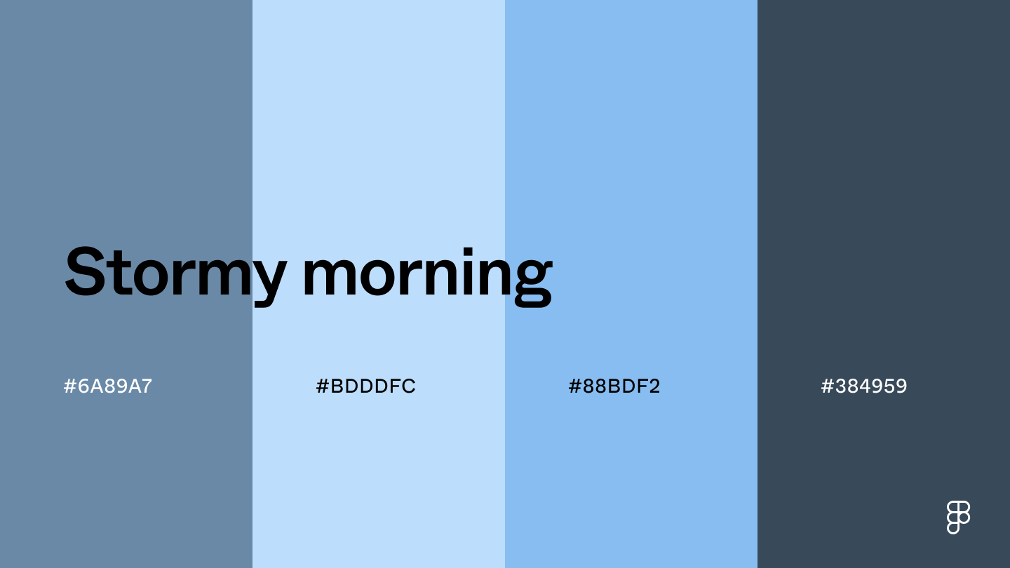 This color scheme features blue-gray hues reminiscent of the visible mist and fog in the air during a stormy morning.
Blue-gray (and its variations) are associated with trustworthiness and reliability, making them useful for creating a professional user interface.
Combination 2: Mossy hollow
This color scheme features blue-gray hues reminiscent of the visible mist and fog in the air during a stormy morning.
Blue-gray (and its variations) are associated with trustworthiness and reliability, making them useful for creating a professional user interface.
Combination 2: Mossy hollow
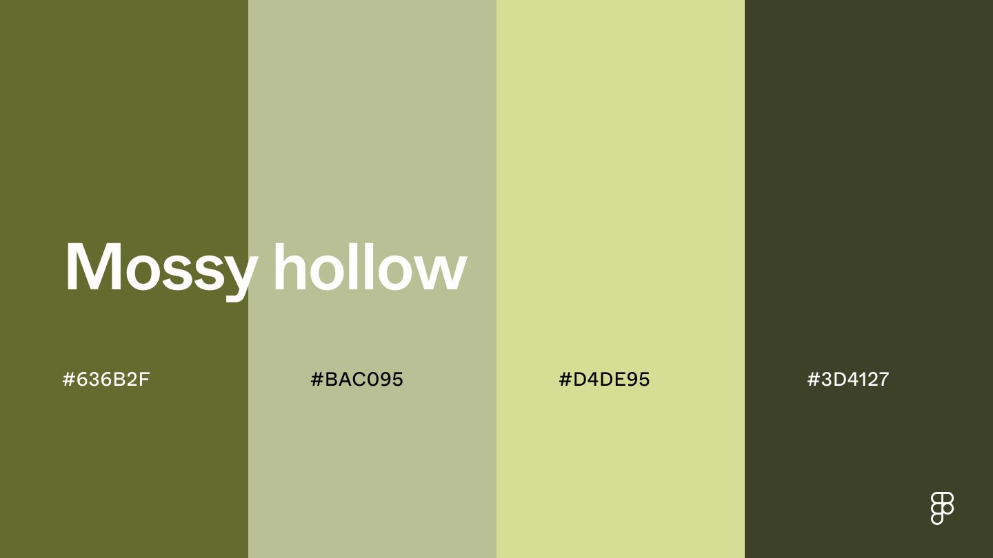 The olive green tones in this color scheme bring a natural and earthy vibe to designs.
The muted shades create a solid base, while the darker shades are great for accents or to add depth for visual interest.
Combination 3: Blue eclipse
The olive green tones in this color scheme bring a natural and earthy vibe to designs.
The muted shades create a solid base, while the darker shades are great for accents or to add depth for visual interest.
Combination 3: Blue eclipse
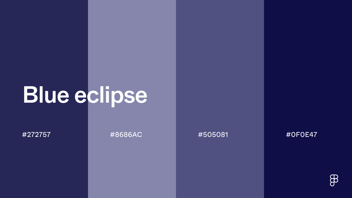 This color combination combines midnight blue hues to convey sophistication in UI design.
Blue’s calming qualities and black’s sophistication make these shades work well for websites with a sleek and modern look.
It’s also a great color combination for platforms using dark mode features to reduce eye strain in low-light environments.
Combination 4: Lush forest
This color combination combines midnight blue hues to convey sophistication in UI design.
Blue’s calming qualities and black’s sophistication make these shades work well for websites with a sleek and modern look.
It’s also a great color combination for platforms using dark mode features to reduce eye strain in low-light environments.
Combination 4: Lush forest
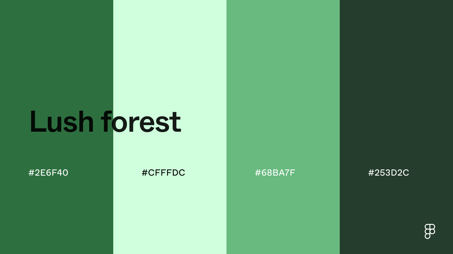 The different hues of forest green make a perfect color combination to bring an organic and neutral feel to interfaces.
It’s a great color palette for apps and websites in the outdoor, agriculture, and environmental spaces.
Use lighter shades for backgrounds and subtle accents and darker hues for primary buttons or text.
Combination 5: Green juice
The different hues of forest green make a perfect color combination to bring an organic and neutral feel to interfaces.
It’s a great color palette for apps and websites in the outdoor, agriculture, and environmental spaces.
Use lighter shades for backgrounds and subtle accents and darker hues for primary buttons or text.
Combination 5: Green juice
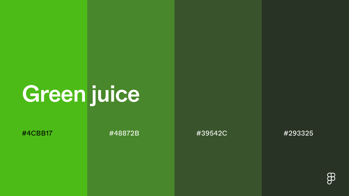 This palette combines shades of kelly green, creating a strong association with health, nature, and energy—a perfect combination for health and wellness apps.
Use the darker shades for text or to add depth to UI elements.
Use the brighter shades to make CTAs and buttons pop.
Combination 6: Chili spice
This palette combines shades of kelly green, creating a strong association with health, nature, and energy—a perfect combination for health and wellness apps.
Use the darker shades for text or to add depth to UI elements.
Use the brighter shades to make CTAs and buttons pop.
Combination 6: Chili spice
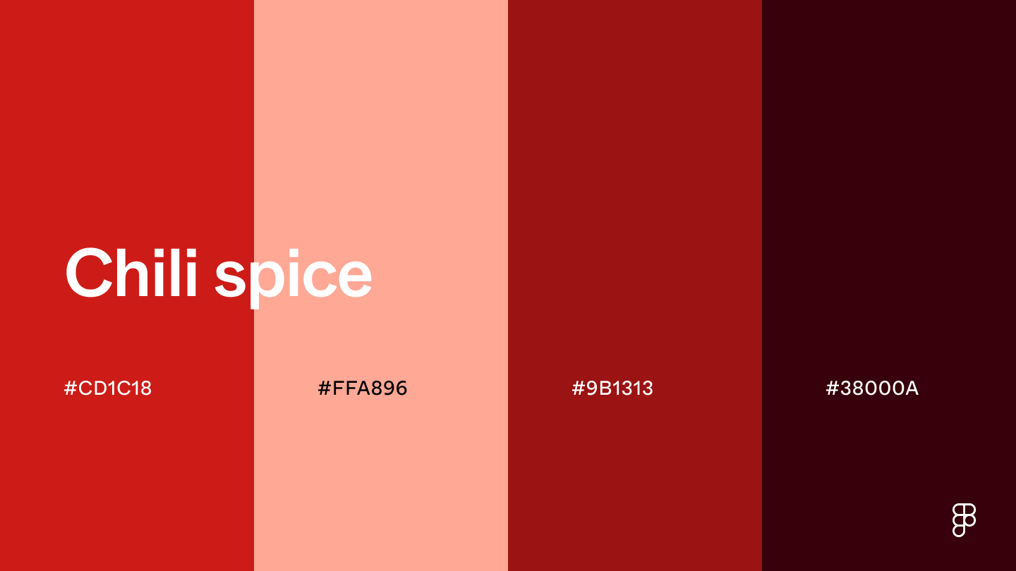 The chili spice monochromatic color palette brings a bold and energetic feeling to UI designs.
The color chili red lives up to its name—its vibrant hue can stimulate a user’s senses, making it the perfect base color for restaurant or food delivery apps.
Romantic color combinations
Create a soft and inviting atmosphere with these romantic color palettes.
Combination 7: Blooming romance
The chili spice monochromatic color palette brings a bold and energetic feeling to UI designs.
The color chili red lives up to its name—its vibrant hue can stimulate a user’s senses, making it the perfect base color for restaurant or food delivery apps.
Romantic color combinations
Create a soft and inviting atmosphere with these romantic color palettes.
Combination 7: Blooming romance
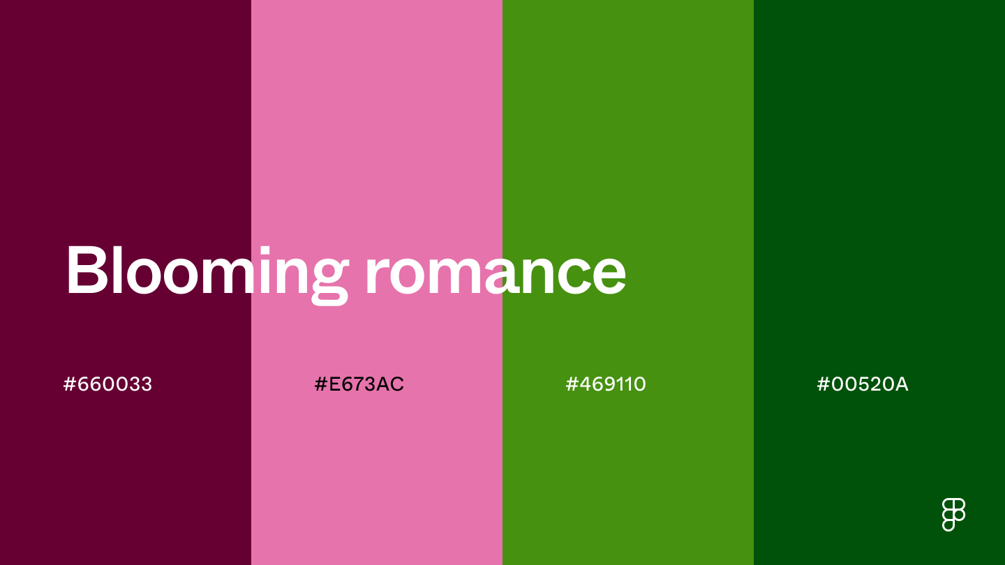 This color palette combines rich shades to bring a sense of sophistication and luxury to UI designs.
The burgundy color can evoke trust and call attention to important elements without overpowering the user.
The green hues complement the pink and purple shades to reinforce the sophisticated feel and ground the design.
Combination 8: Desert dusk
This color palette combines rich shades to bring a sense of sophistication and luxury to UI designs.
The burgundy color can evoke trust and call attention to important elements without overpowering the user.
The green hues complement the pink and purple shades to reinforce the sophisticated feel and ground the design.
Combination 8: Desert dusk
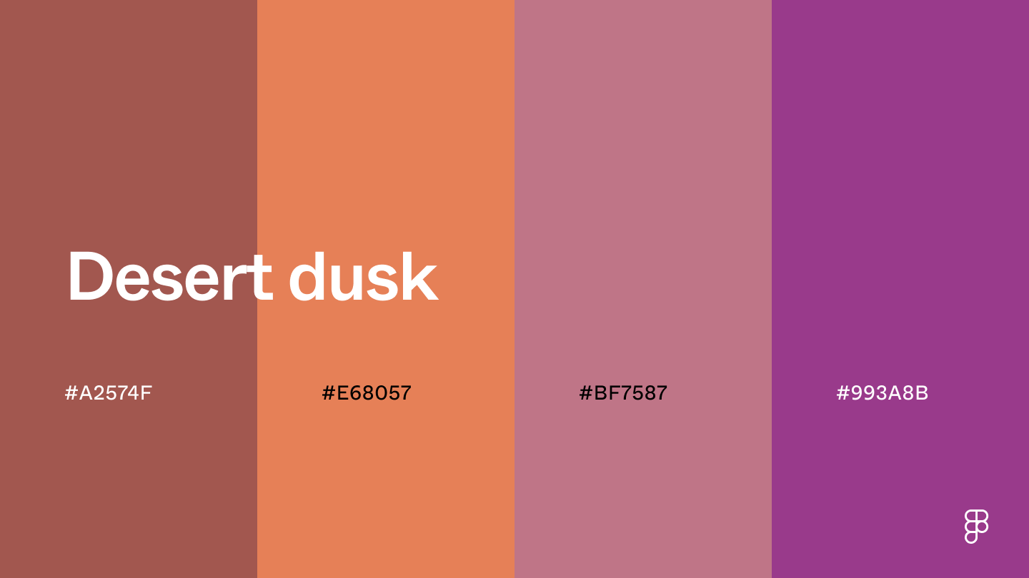 This color combination evokes a sense of sophistication with a touch of warmth.
Cognac’s reddish brown hues along with muted orange and purple shades offer a luxurious feel, making this palette perfect for websites that sell high-end products and luxury goods.
Combination 9: Lavender fields
This color combination evokes a sense of sophistication with a touch of warmth.
Cognac’s reddish brown hues along with muted orange and purple shades offer a luxurious feel, making this palette perfect for websites that sell high-end products and luxury goods.
Combination 9: Lavender fields
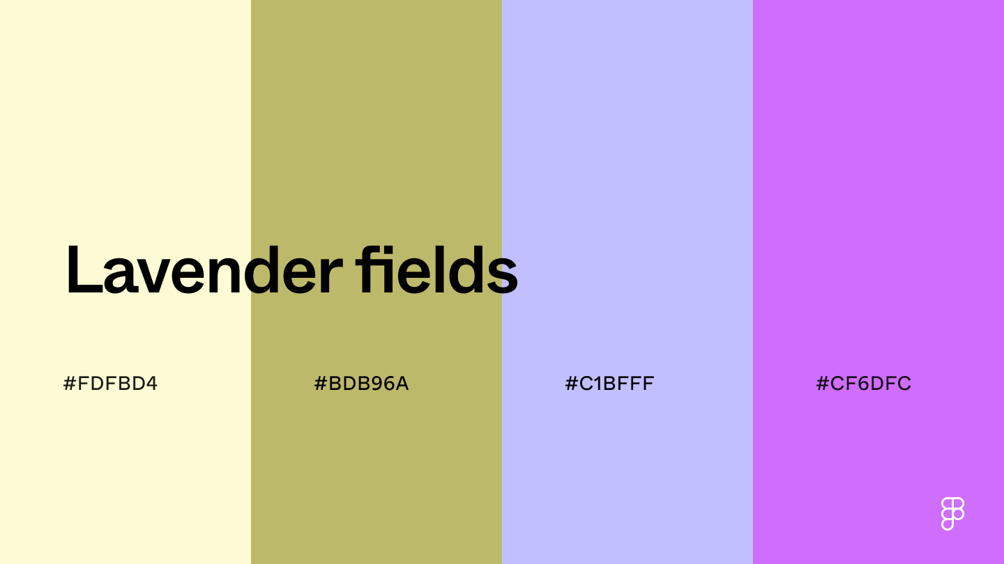 This combination of light and muted colors brings a dreamy and whimsical feel to designs.
Use cream or light purple as a calming background, with slightly darker hues as accent shades or CTA buttons that pop against the soft base.
Combination 10: Hydrangea
This combination of light and muted colors brings a dreamy and whimsical feel to designs.
Use cream or light purple as a calming background, with slightly darker hues as accent shades or CTA buttons that pop against the soft base.
Combination 10: Hydrangea
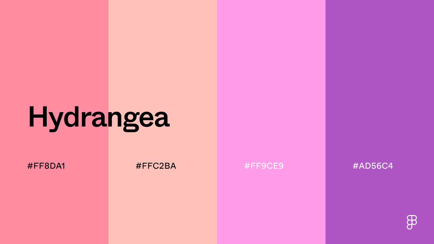 This color combination captures the soft yet vibrant hues of pink hydrangeas.
The different shades of pink and purple are helpful for UI designs aiming for a welcoming and soothing atmosphere.
These hues can also add a touch of youthfulness and innocence, making this pairing suitable for children’s apps or playful UIs.
Combination 11: Cactus flower
This color combination captures the soft yet vibrant hues of pink hydrangeas.
The different shades of pink and purple are helpful for UI designs aiming for a welcoming and soothing atmosphere.
These hues can also add a touch of youthfulness and innocence, making this pairing suitable for children’s apps or playful UIs.
Combination 11: Cactus flower
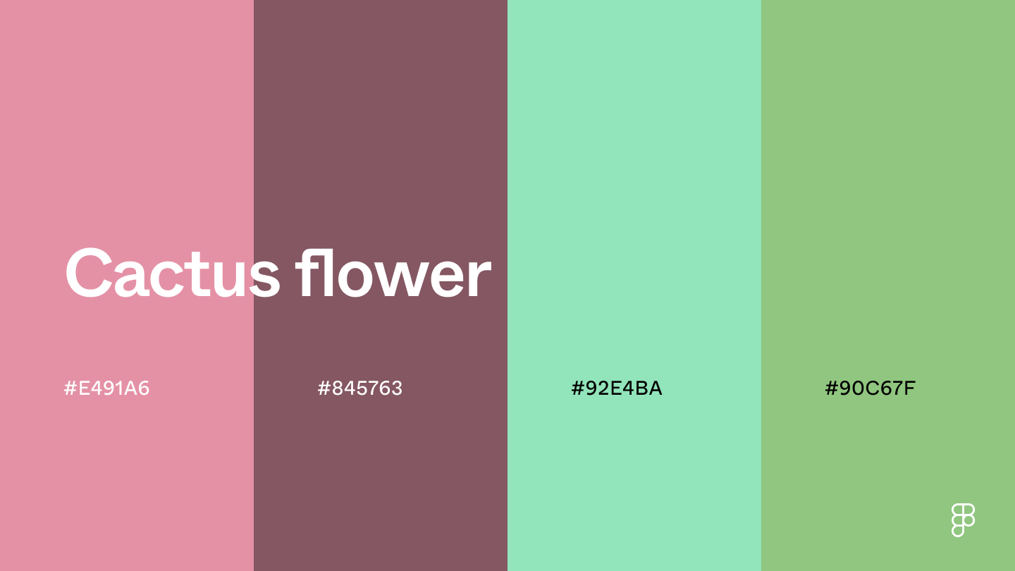 The use of light pinks, like the color puce, and soft shades of green in this color scheme evokes a natural and organic feel.
The soft shades also exude a sense of romance, perfect for websites or apps in the wedding or event planning space.
The natural green shades also promote a connection to nature, which is ideal for wellness and eco-friendly apps.
Combination 12: Wildflowers
The use of light pinks, like the color puce, and soft shades of green in this color scheme evokes a natural and organic feel.
The soft shades also exude a sense of romance, perfect for websites or apps in the wedding or event planning space.
The natural green shades also promote a connection to nature, which is ideal for wellness and eco-friendly apps.
Combination 12: Wildflowers
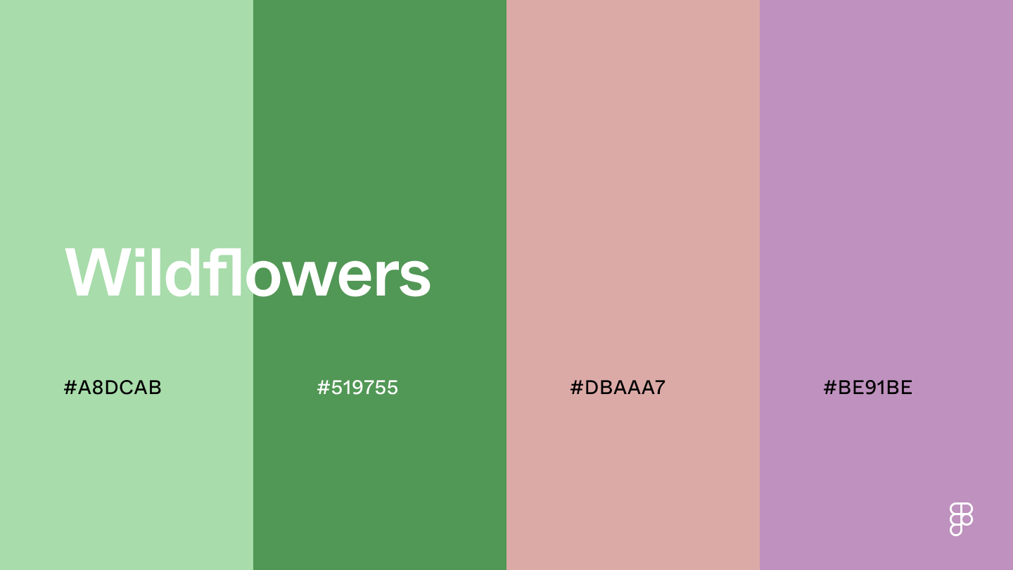 The tranquility of celadon and other green shades can create a calming and grounding effect, while the rosy purple hues add a timeless charm.
This color combination is useful for spas and wellness apps promoting relaxation or luxury and fashion platforms going for a vintage aesthetic.
Combination 13: Country garden
The tranquility of celadon and other green shades can create a calming and grounding effect, while the rosy purple hues add a timeless charm.
This color combination is useful for spas and wellness apps promoting relaxation or luxury and fashion platforms going for a vintage aesthetic.
Combination 13: Country garden
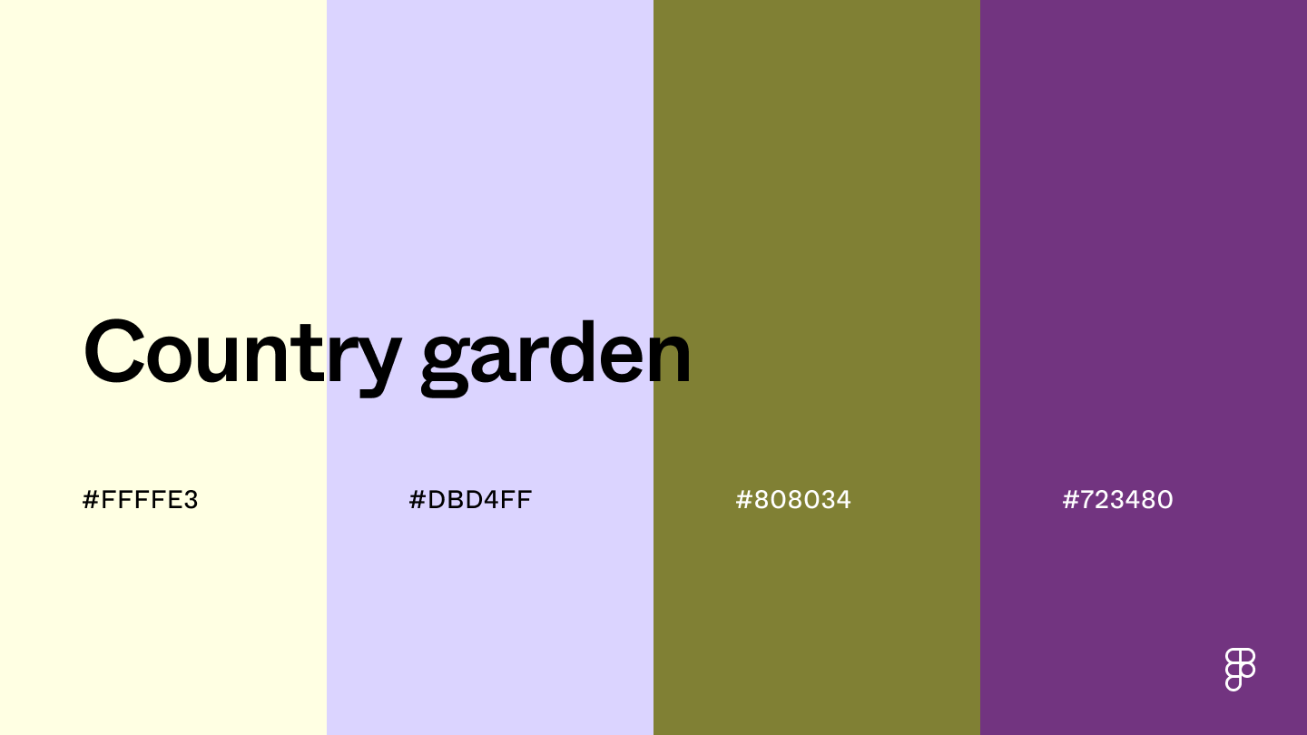 This color palette’s ivory and lavender base creates a sense of calmness and sophistication, while the olive shade adds a natural feel.
The deep purple hue ties them together to add subtle depth and balance that complements the lighter shades.
Combination 14: Lotus garden
This color palette’s ivory and lavender base creates a sense of calmness and sophistication, while the olive shade adds a natural feel.
The deep purple hue ties them together to add subtle depth and balance that complements the lighter shades.
Combination 14: Lotus garden
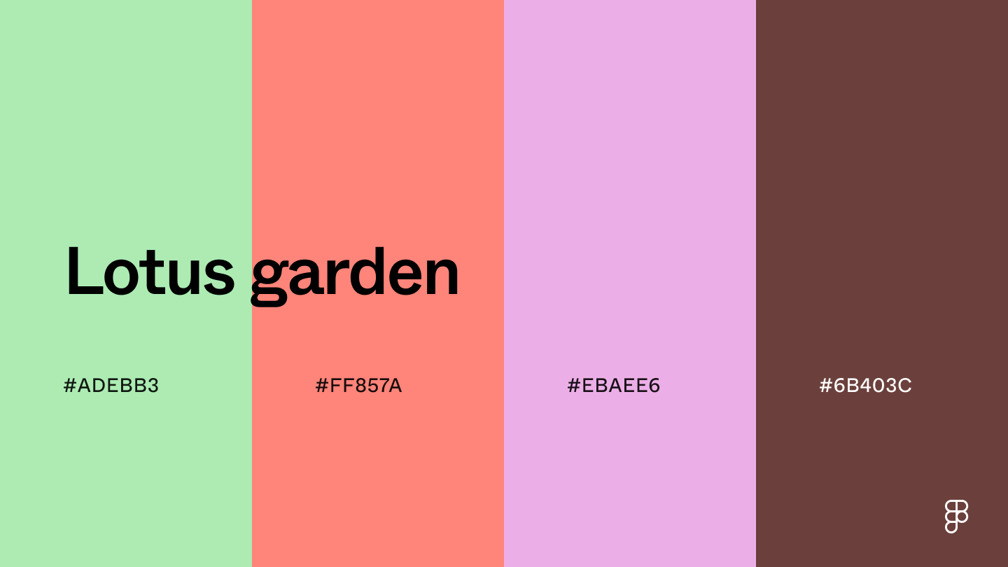 This palette combines muted and rich shades to create a welcoming atmosphere.
Mint green, coral, and muted purple shades create an energetic yet calming feeling, while the brown hue adds a touch of depth and sophistication.
This color combination suits creative platforms that want a pop of color with a high-end feel.
Combination 15: Iris garden
This palette combines muted and rich shades to create a welcoming atmosphere.
Mint green, coral, and muted purple shades create an energetic yet calming feeling, while the brown hue adds a touch of depth and sophistication.
This color combination suits creative platforms that want a pop of color with a high-end feel.
Combination 15: Iris garden
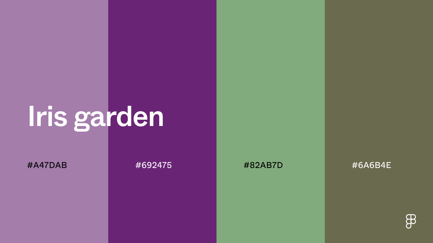 This color palette includes a tapestry of lilac and sage hues, as seen in an iris garden.
The purple shades offer a sense of luxury, while the muted green hues add a natural touch to keep the UI from feeling overly dark.
Combination 16: Fresh peach
This color palette includes a tapestry of lilac and sage hues, as seen in an iris garden.
The purple shades offer a sense of luxury, while the muted green hues add a natural touch to keep the UI from feeling overly dark.
Combination 16: Fresh peach
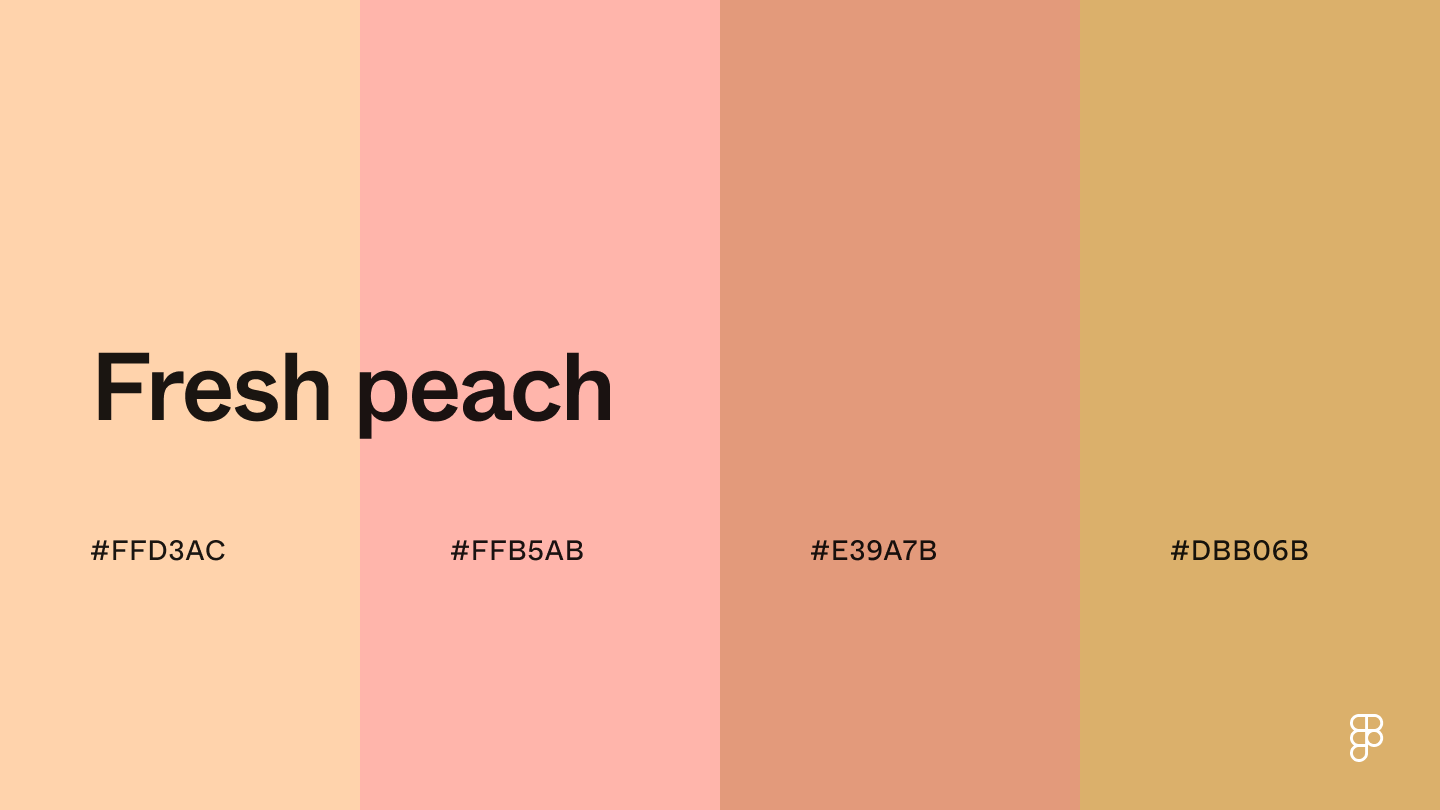 The peach shades in this color palette create a warm and welcoming ambiance.
The light hues are great as background colors and keep the UI fresh and airy.
Use the darker shades for accents or to make buttons stand out without overwhelming the user.
Playful color combinations
Inject fun and excitement into your designs with these playful color combinations.
Combination 17: Zesty lemon
The peach shades in this color palette create a warm and welcoming ambiance.
The light hues are great as background colors and keep the UI fresh and airy.
Use the darker shades for accents or to make buttons stand out without overwhelming the user.
Playful color combinations
Inject fun and excitement into your designs with these playful color combinations.
Combination 17: Zesty lemon
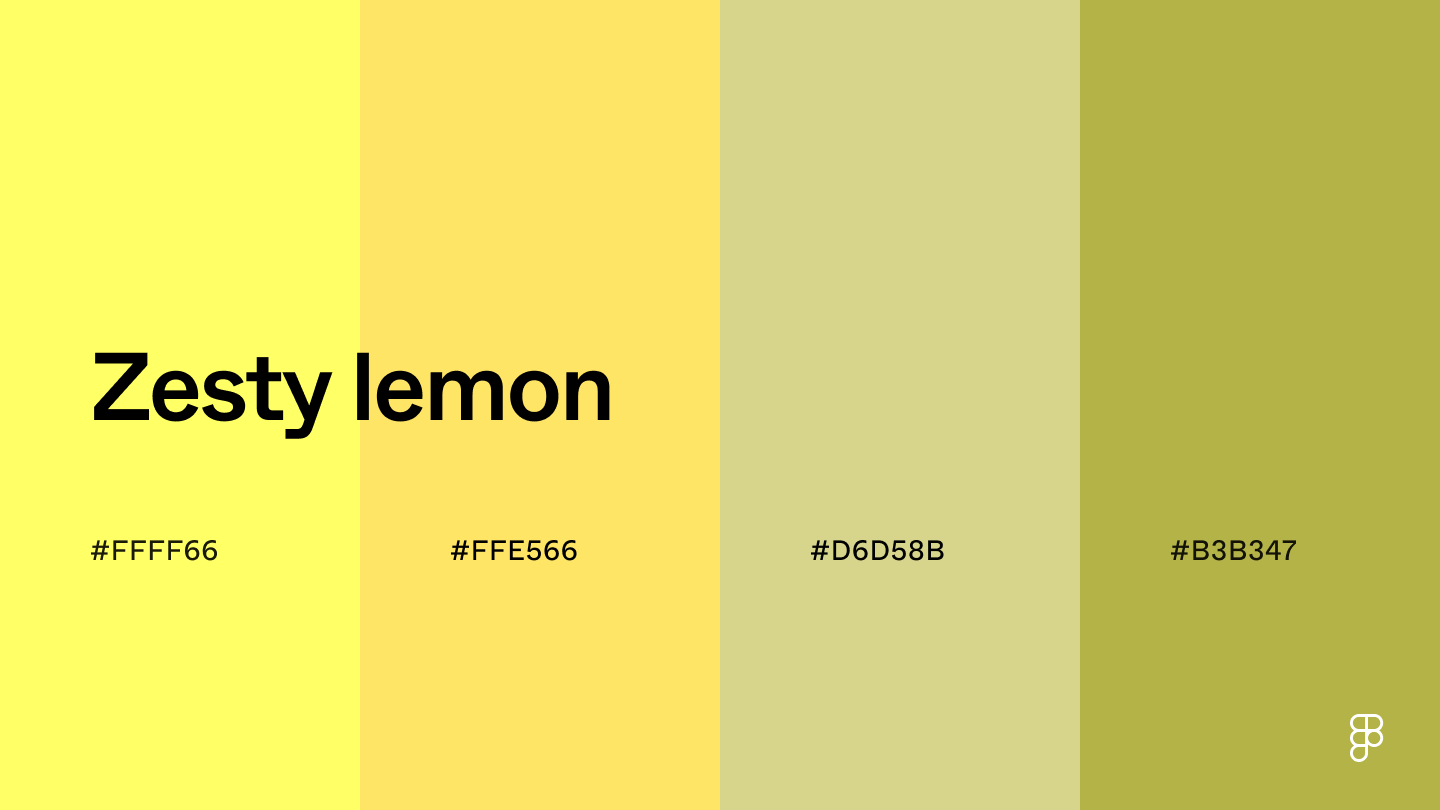 The shades of yellow in this monochromatic color scheme bring a sunny and cheerful vibe to any design.
The bright and joyous colors are perfect for engaging young users with children’s apps or games.
Yellow can also evoke a sense of knowledge and optimism, making it great for educational websites and learning apps.
Combination 18: California beaches
The shades of yellow in this monochromatic color scheme bring a sunny and cheerful vibe to any design.
The bright and joyous colors are perfect for engaging young users with children’s apps or games.
Yellow can also evoke a sense of knowledge and optimism, making it great for educational websites and learning apps.
Combination 18: California beaches
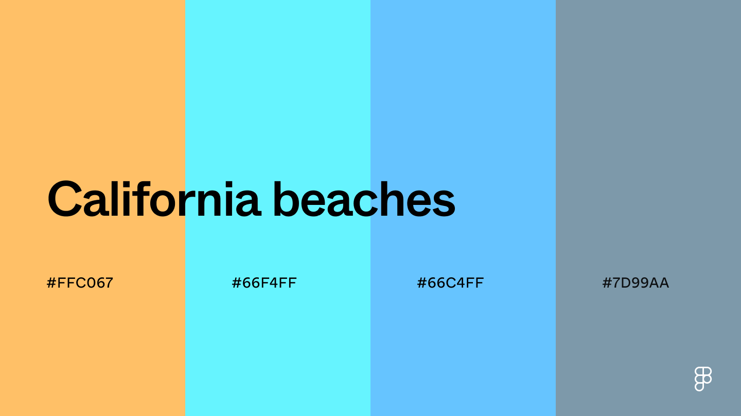 This color scheme combines light and bright colors to create an energetic yet relaxing feel in your designs.
Pastel orange offers warmth while evoking stimulating energy, and the different blue hues add a touch of professionalism and balance.
This makes it a perfect color choice for apps promoting creativity or physical activity.
Combination 19: Freshly squeezed
This color scheme combines light and bright colors to create an energetic yet relaxing feel in your designs.
Pastel orange offers warmth while evoking stimulating energy, and the different blue hues add a touch of professionalism and balance.
This makes it a perfect color choice for apps promoting creativity or physical activity.
Combination 19: Freshly squeezed
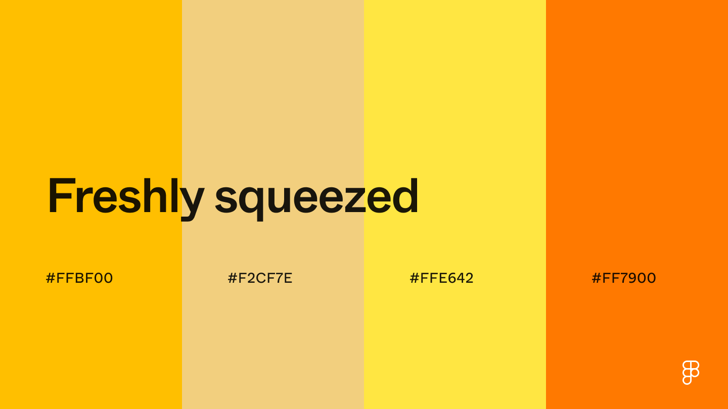 This bright and stimulating color palette evokes a sense of summer freshness.
Amber creates a warm, comforting atmosphere—perfect for social apps prompting user engagement.
The orange and yellow shades also bring an energetic feel, which can help motivate users on fitness or health apps.
Combination 20: Pistachio dream
This bright and stimulating color palette evokes a sense of summer freshness.
Amber creates a warm, comforting atmosphere—perfect for social apps prompting user engagement.
The orange and yellow shades also bring an energetic feel, which can help motivate users on fitness or health apps.
Combination 20: Pistachio dream
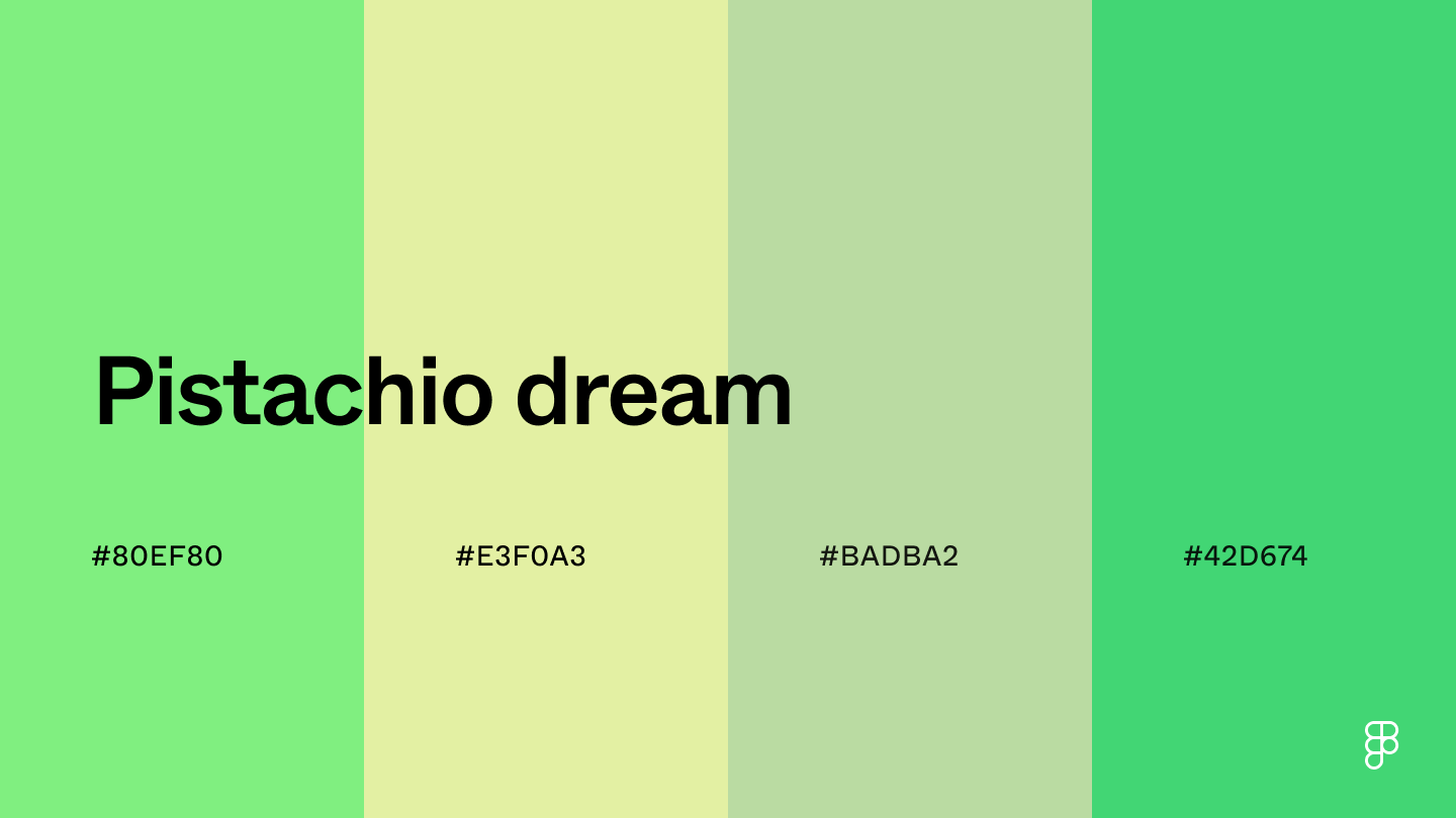 Pastel green and other muted shades of green bring a sense of freshness and youthfulness to this color combination.
These shades can promote feelings of peace, making them great for wellness or meditation apps.
This color palette can also promote concentration without being overly stimulating—a perfect environment for productivity platforms.
Combination 21: Mango popsicle
Pastel green and other muted shades of green bring a sense of freshness and youthfulness to this color combination.
These shades can promote feelings of peace, making them great for wellness or meditation apps.
This color palette can also promote concentration without being overly stimulating—a perfect environment for productivity platforms.
Combination 21: Mango popsicle
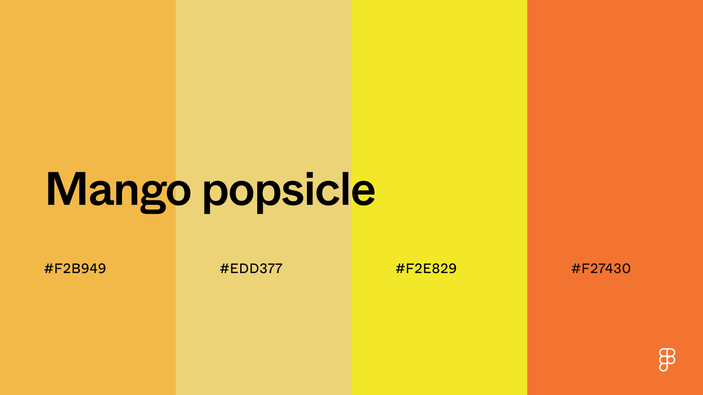 Infusing the color mimosa and other orange and yellow shades brings a cheerful and energetic feeling to projects.
This color scheme evokes a sense of fun for travel or tourism apps promoting adventure.
The summery feel associated with enjoying a mango popsicle can also suit apps promoting summer products.
Combination 22: Guava
Infusing the color mimosa and other orange and yellow shades brings a cheerful and energetic feeling to projects.
This color scheme evokes a sense of fun for travel or tourism apps promoting adventure.
The summery feel associated with enjoying a mango popsicle can also suit apps promoting summer products.
Combination 22: Guava
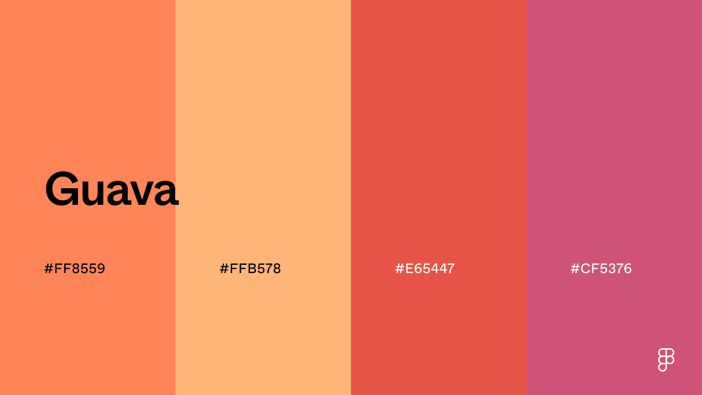 This combination of orangey-red shades like coral and deeper purple hues creates a relaxing, tropical vibe.
Use the vibrant shades to guide a user’s eye to important elements and the softer hues to maintain a calming backdrop.
Combination 23: Glowing horizon
This combination of orangey-red shades like coral and deeper purple hues creates a relaxing, tropical vibe.
Use the vibrant shades to guide a user’s eye to important elements and the softer hues to maintain a calming backdrop.
Combination 23: Glowing horizon
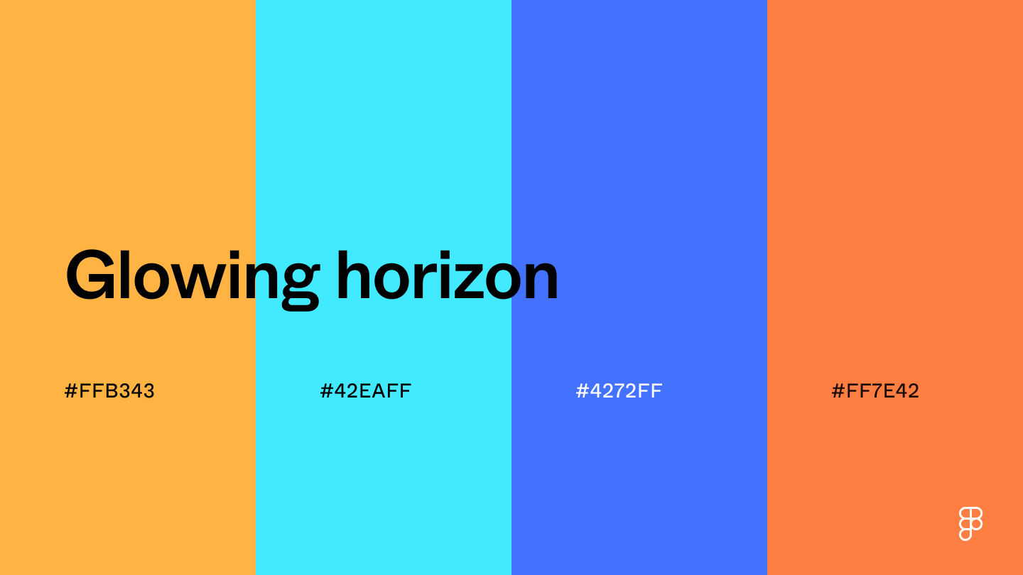 A glowing horizon's orange and blue hues come together to create this complementary color palette.
With yellow-orange as the prominent color, this combination brings a vibrant and energetic vibe to your designs.
Combination 24: Sunny day
A glowing horizon's orange and blue hues come together to create this complementary color palette.
With yellow-orange as the prominent color, this combination brings a vibrant and energetic vibe to your designs.
Combination 24: Sunny day
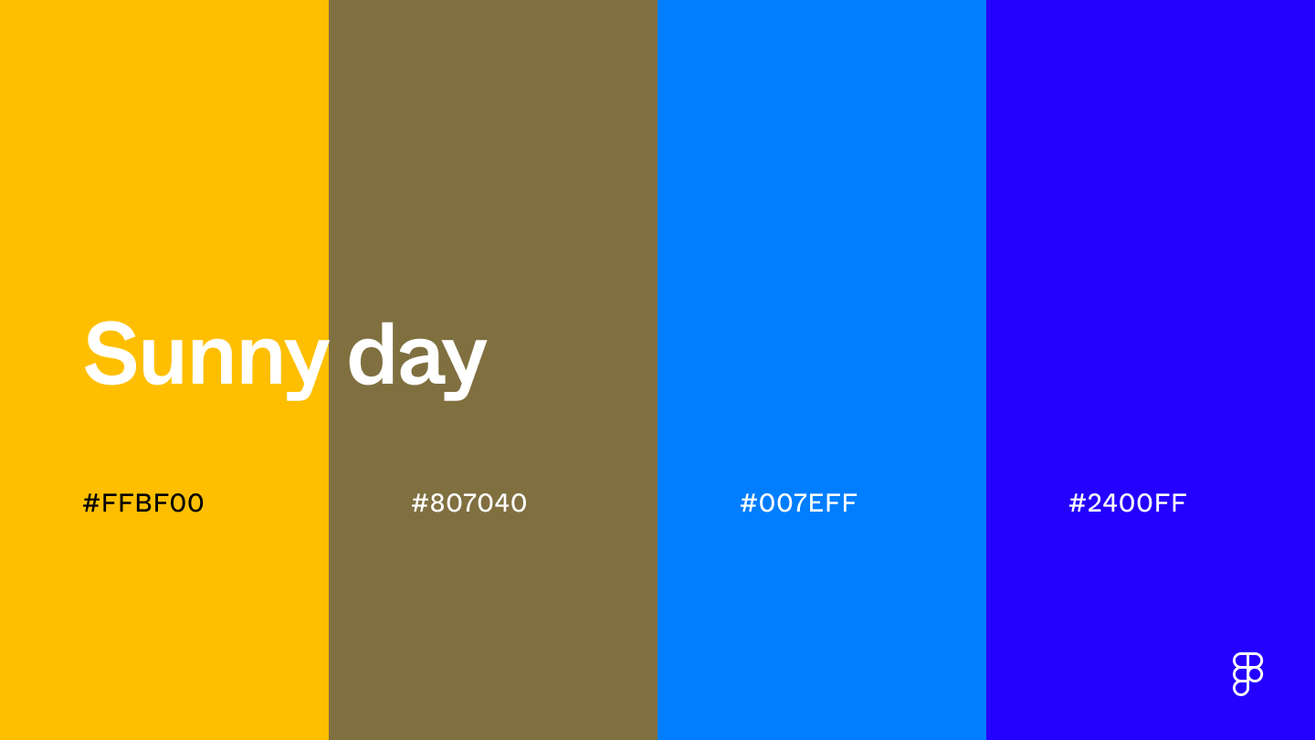 Amber and its complementary shades create a color combination that evokes the vibrancy of a sunny day.
Like the sun, this color palette adds warmth to UI designs, creating an inviting user experience.
Vibrant color combinations
While sometimes unconventional, these bold hues and playful pairings bring an energetic vibe to UI designs to capture a user’s attention.
Combination 25: Alchemical reaction
Amber and its complementary shades create a color combination that evokes the vibrancy of a sunny day.
Like the sun, this color palette adds warmth to UI designs, creating an inviting user experience.
Vibrant color combinations
While sometimes unconventional, these bold hues and playful pairings bring an energetic vibe to UI designs to capture a user’s attention.
Combination 25: Alchemical reaction
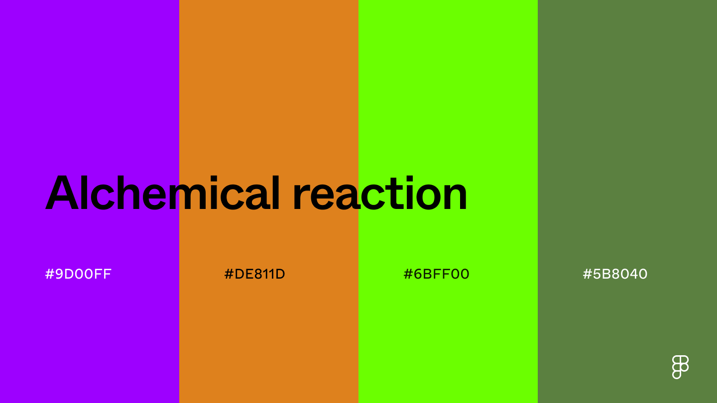 This color palette’s purple, orange, and green hues create an intriguing and slightly scientific feel.
These bold and futuristic shades can represent innovation and complexity, which is great for fintech or cryptocurrency apps.
The energetic appeal also makes it ideal for educational apps for young learners.
Combination 26: Electropop
This color palette’s purple, orange, and green hues create an intriguing and slightly scientific feel.
These bold and futuristic shades can represent innovation and complexity, which is great for fintech or cryptocurrency apps.
The energetic appeal also makes it ideal for educational apps for young learners.
Combination 26: Electropop
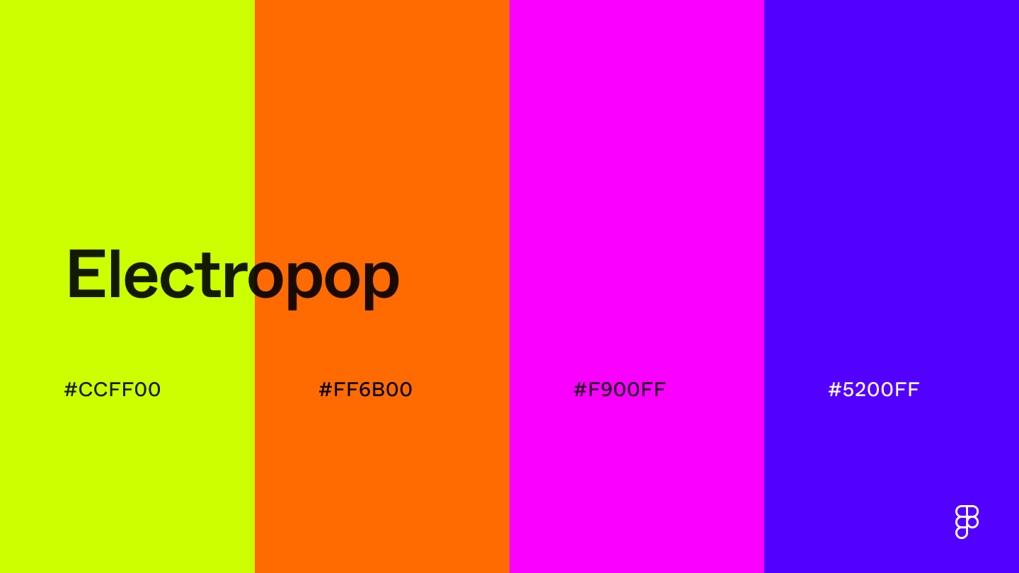 As the name suggests, these bold and vibrant shades create a truly electrifying color combination.
The dominance of bright, saturated hues like chartreuse brings a lively and fun appeal to designs.
Use this color scheme for music or streaming apps to reflect the energy and vibrancy of music or for gaming apps packed with energy and stimulation.
Combination 27: Cool revival
As the name suggests, these bold and vibrant shades create a truly electrifying color combination.
The dominance of bright, saturated hues like chartreuse brings a lively and fun appeal to designs.
Use this color scheme for music or streaming apps to reflect the energy and vibrancy of music or for gaming apps packed with energy and stimulation.
Combination 27: Cool revival
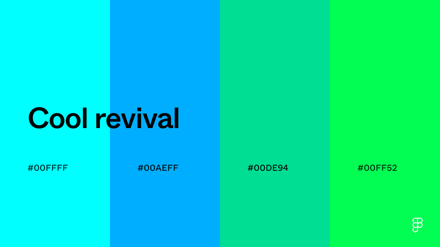 This color combination includes cool shades like cyan that convey tranquility and creativity.
The bright blue-green hue adds a touch of vibrancy that’s perfect for highlights to make other elements stand out.
These refreshing shades can also promote focus and organization—ideal for project management apps.
Combination 28: Neon jungle
This color combination includes cool shades like cyan that convey tranquility and creativity.
The bright blue-green hue adds a touch of vibrancy that’s perfect for highlights to make other elements stand out.
These refreshing shades can also promote focus and organization—ideal for project management apps.
Combination 28: Neon jungle
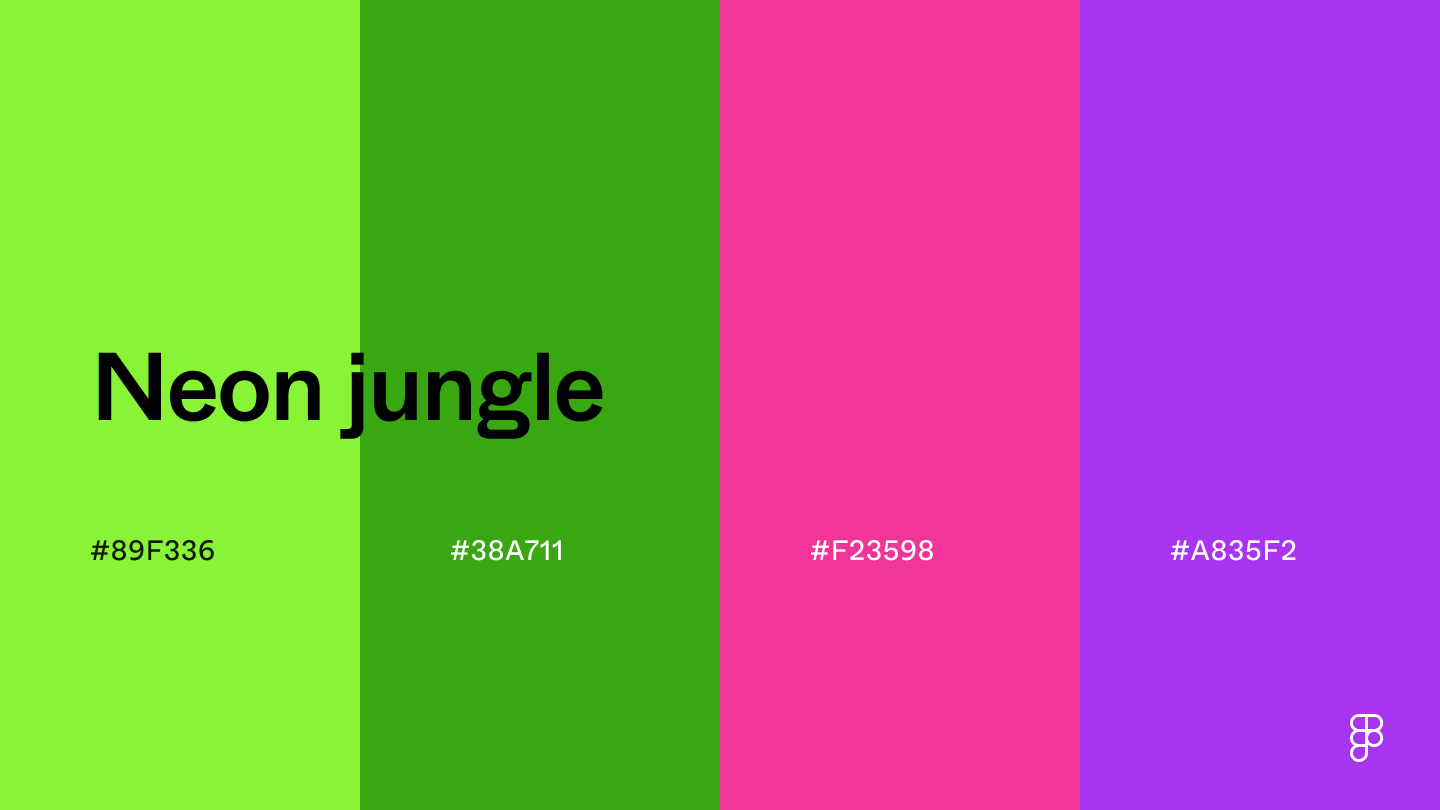 Neon jungle features bold shades like lime green and violet to create a high-contrast color combination.
If lime green or magenta takes center stage, it could create a playful and energetic vibe.
If the dark or purple shades are the focal point, it leans toward a sophisticated feel.
Combination 29: Sharp edge
Neon jungle features bold shades like lime green and violet to create a high-contrast color combination.
If lime green or magenta takes center stage, it could create a playful and energetic vibe.
If the dark or purple shades are the focal point, it leans toward a sophisticated feel.
Combination 29: Sharp edge
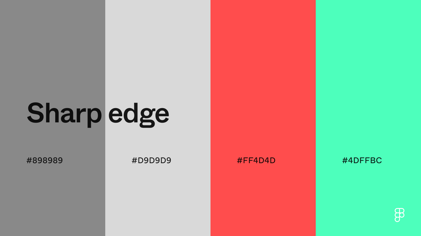 This color combination injects a pop of color into neutral designs.
With gray colors as a base, the red and blue-green shades help create a sense of urgency or add a touch of playfulness to an interface.
Combination 30: Electric fusion
This color combination injects a pop of color into neutral designs.
With gray colors as a base, the red and blue-green shades help create a sense of urgency or add a touch of playfulness to an interface.
Combination 30: Electric fusion
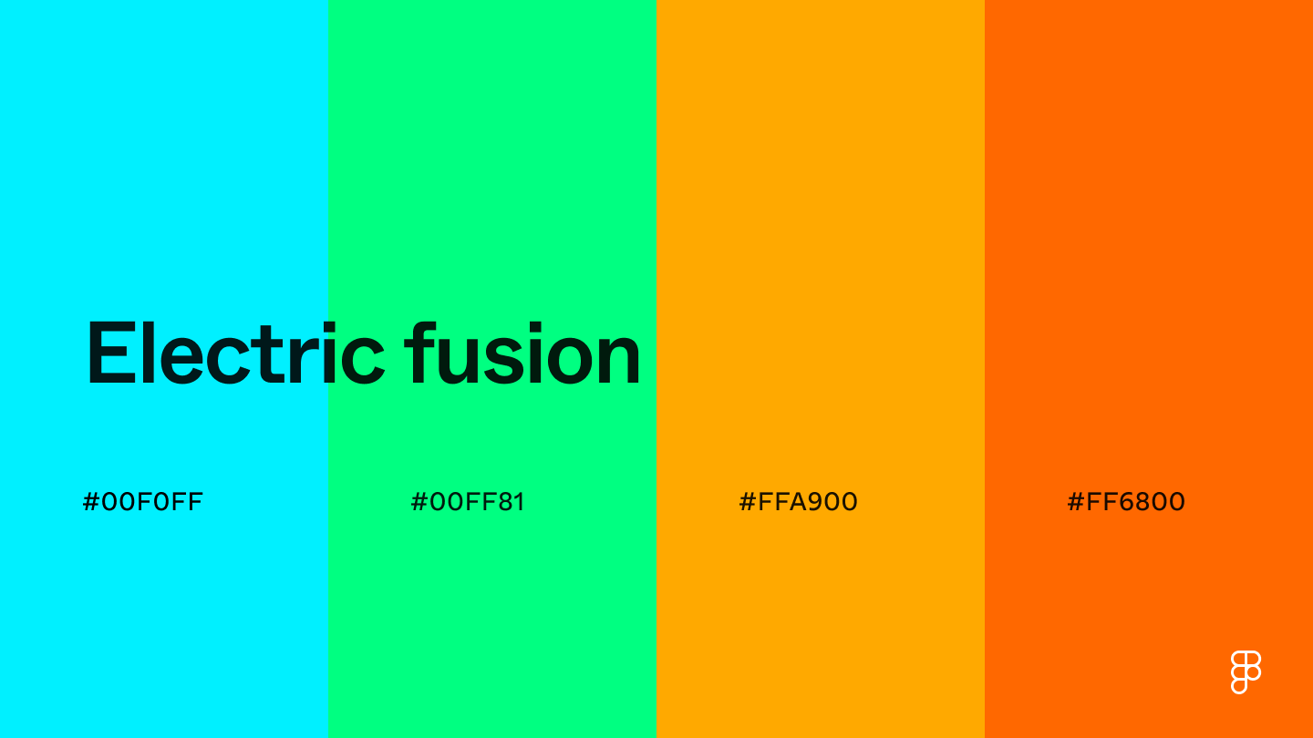 Electric fusion brings a sense of energy and vibrancy.
Colors like electric blue can instill confidence and motivate users, making it an excellent shade for fitness and sports apps.
It’s important to carefully consider the placement and use of each color, as placing too much emphasis on the brighter shades can create a visually overwhelming experience.
Consider adding a neutral shade or adjusting the color values to create a more balanced feel.
Combination 31: Fireworks
Electric fusion brings a sense of energy and vibrancy.
Colors like electric blue can instill confidence and motivate users, making it an excellent shade for fitness and sports apps.
It’s important to carefully consider the placement and use of each color, as placing too much emphasis on the brighter shades can create a visually overwhelming experience.
Consider adding a neutral shade or adjusting the color values to create a more balanced feel.
Combination 31: Fireworks
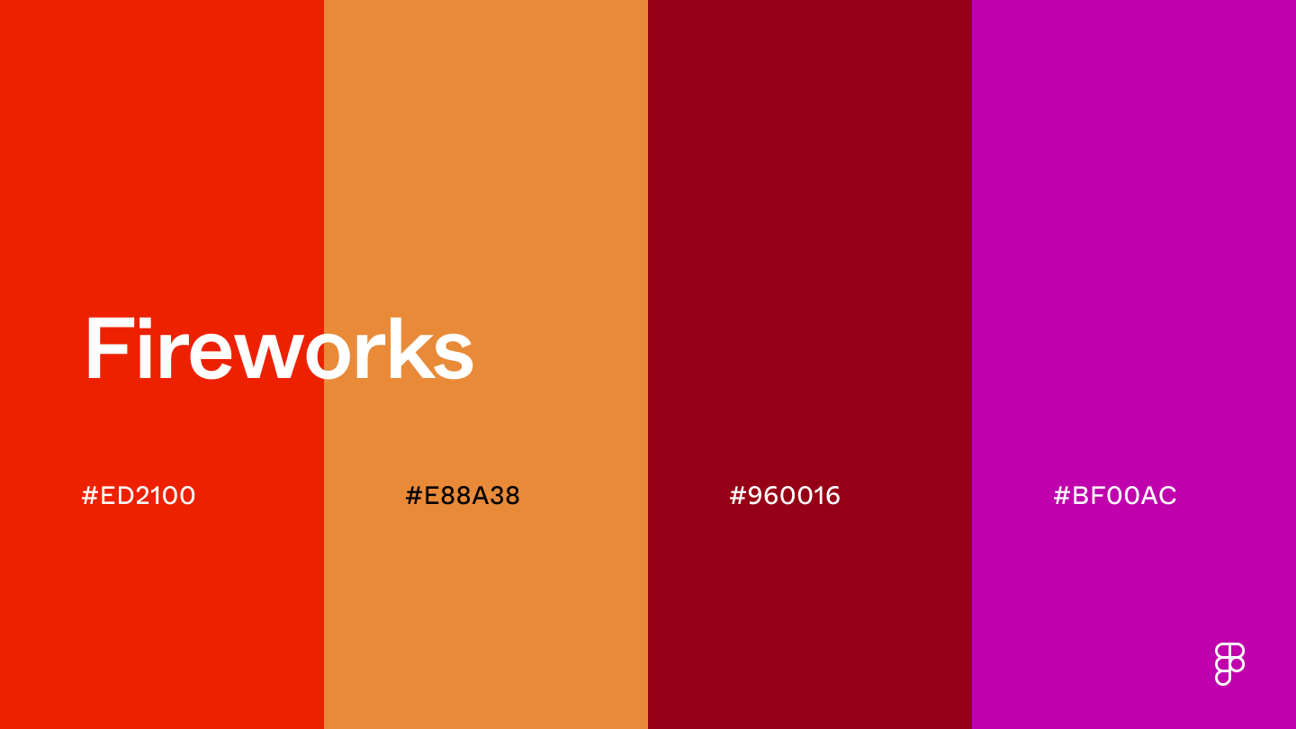 Just like fireworks, this color palette can add a bold and dramatic flair to UI designs.
The color scarlet has a vibrancy that’s great for CTA buttons and clickable elements urging user action.
The deeper orange, red, and purple hues tone down scarlet’s vibrancy to create a luxurious and sophisticated color combination.
Combination 32: Space berries
Just like fireworks, this color palette can add a bold and dramatic flair to UI designs.
The color scarlet has a vibrancy that’s great for CTA buttons and clickable elements urging user action.
The deeper orange, red, and purple hues tone down scarlet’s vibrancy to create a luxurious and sophisticated color combination.
Combination 32: Space berries
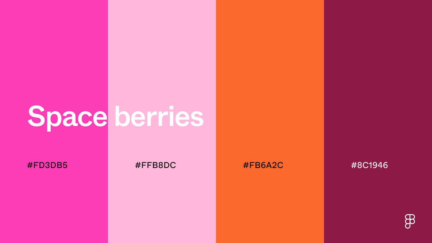 This color palette combines the vibrancy of magenta with soft pink, orange, and deep purple to bring a touch of romance and femininity to designs.
To keep the UI light and airy, use pink as the focal point, or play into the deep purple shade to add a touch of luxury and sophistication.
Neutral color combinations
Explore these timeless and versatile color palettes that provide a solid and sophisticated foundation to any UI design.
Combination 33: Salt and pepper
This color palette combines the vibrancy of magenta with soft pink, orange, and deep purple to bring a touch of romance and femininity to designs.
To keep the UI light and airy, use pink as the focal point, or play into the deep purple shade to add a touch of luxury and sophistication.
Neutral color combinations
Explore these timeless and versatile color palettes that provide a solid and sophisticated foundation to any UI design.
Combination 33: Salt and pepper
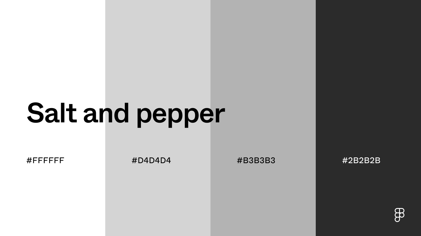 This neutral color scheme includes white and gray shades for a modern, professional, clean interface.
These colors are useful for apps with a minimal aesthetic that promotes focus, like productivity apps or for e-commerce websites where the products take center stage.
Combination 34: Quite clear
This neutral color scheme includes white and gray shades for a modern, professional, clean interface.
These colors are useful for apps with a minimal aesthetic that promotes focus, like productivity apps or for e-commerce websites where the products take center stage.
Combination 34: Quite clear
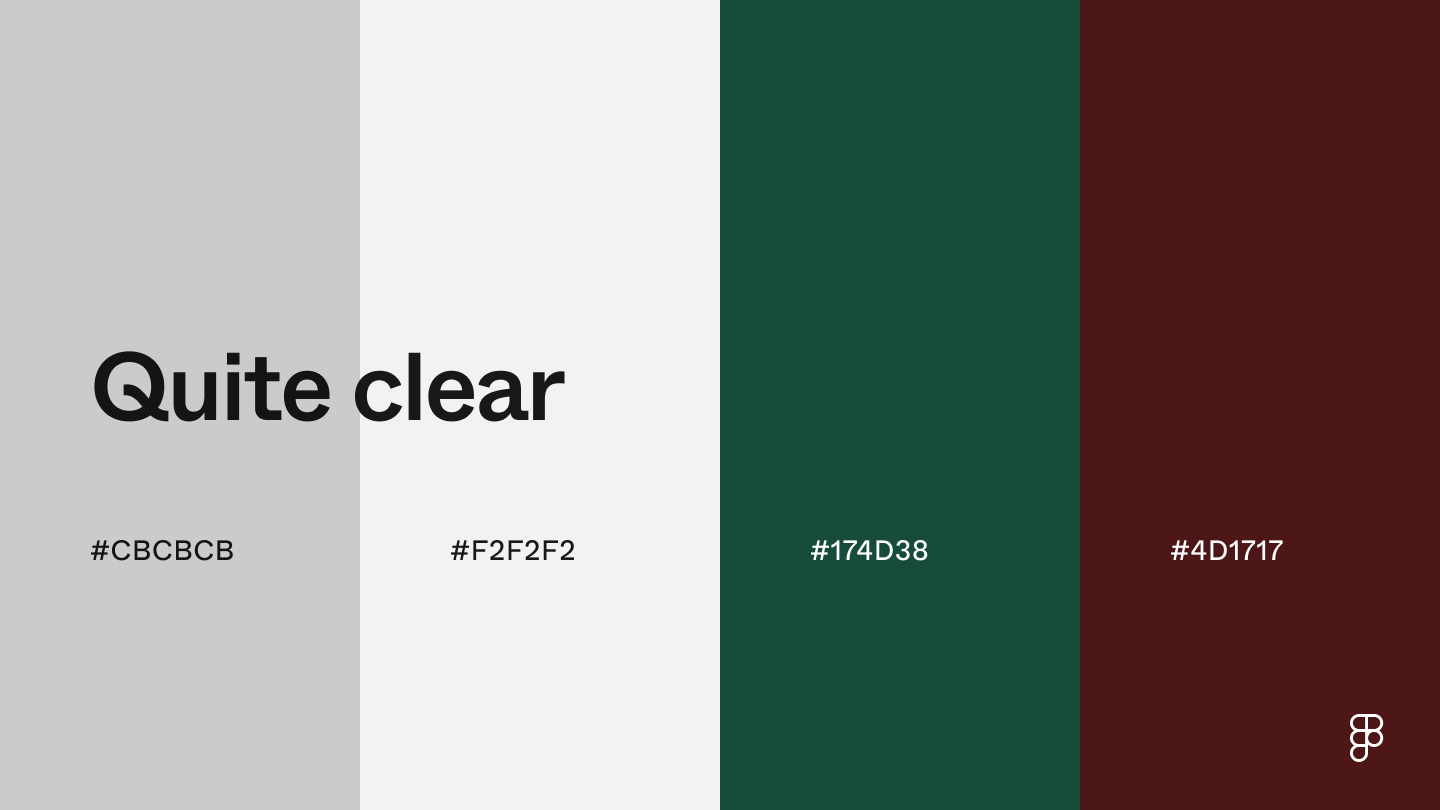 Cool gray paired with deep green and rich brown evoke a sense of professionalism and sophistication.
This combination promotes trust and security and is great for networking websites or finance and banking apps.
Combination 35: Gothic noir
Cool gray paired with deep green and rich brown evoke a sense of professionalism and sophistication.
This combination promotes trust and security and is great for networking websites or finance and banking apps.
Combination 35: Gothic noir
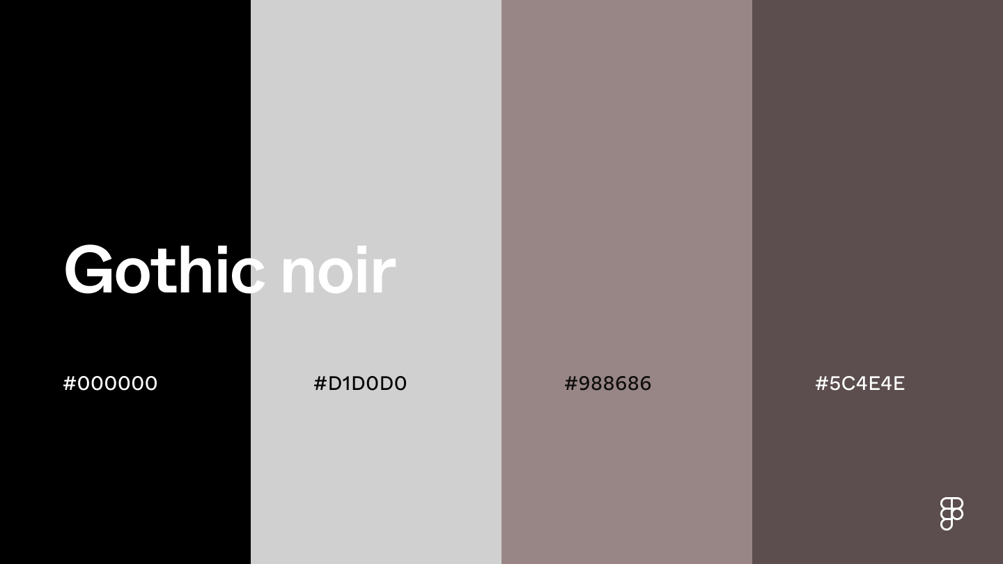 This color palette’s black, gray, and taupe shades create a sophisticated and moody pairing.
Using the lightest shade as the background and the other shades for highlights and accents leads to a pleasing design that’s not overly dark.
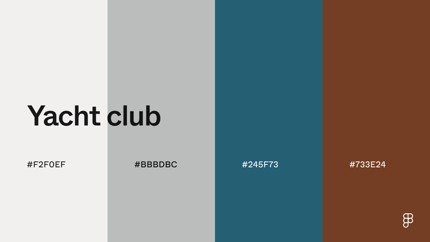
Combination 36: Yacht club
This color palette’s black, gray, and taupe shades create a sophisticated and moody pairing.
Using the lightest shade as the background and the other shades for highlights and accents leads to a pleasing design that’s not overly dark.
Combination 36: Yacht club
 The balance of the off-white hues and blue and brown shades combine to create this neutral palette with a touch of earthiness.
This color combination creates a sense of calmness, with grounding qualities from brown’s warmth.
The deep blue shade adds a hint of coolness and vibrancy while maintaining a relaxing vibe—great for wellness, gardening, and nature apps.
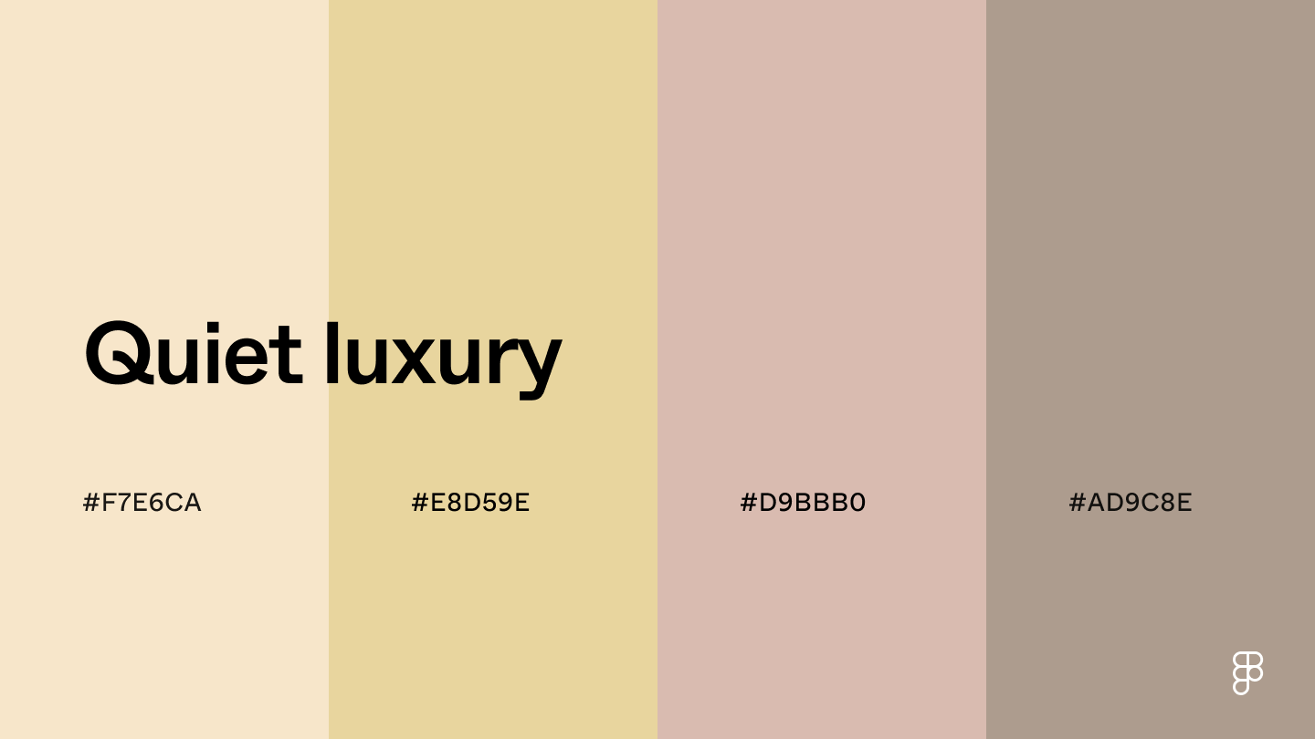
Combination 37: Quiet luxury
The balance of the off-white hues and blue and brown shades combine to create this neutral palette with a touch of earthiness.
This color combination creates a sense of calmness, with grounding qualities from brown’s warmth.
The deep blue shade adds a hint of coolness and vibrancy while maintaining a relaxing vibe—great for wellness, gardening, and nature apps.
Combination 37: Quiet luxury
 This soft color palette is perfect for wedding websites or fashion brands celebrating romance.
Champagne’s yellow and pink undertones evoke elegance, while the muted pink and brown hues give a vintage feel.
This pairing has subtle pops of color while remaining neutral, creating a calming and inviting interface.
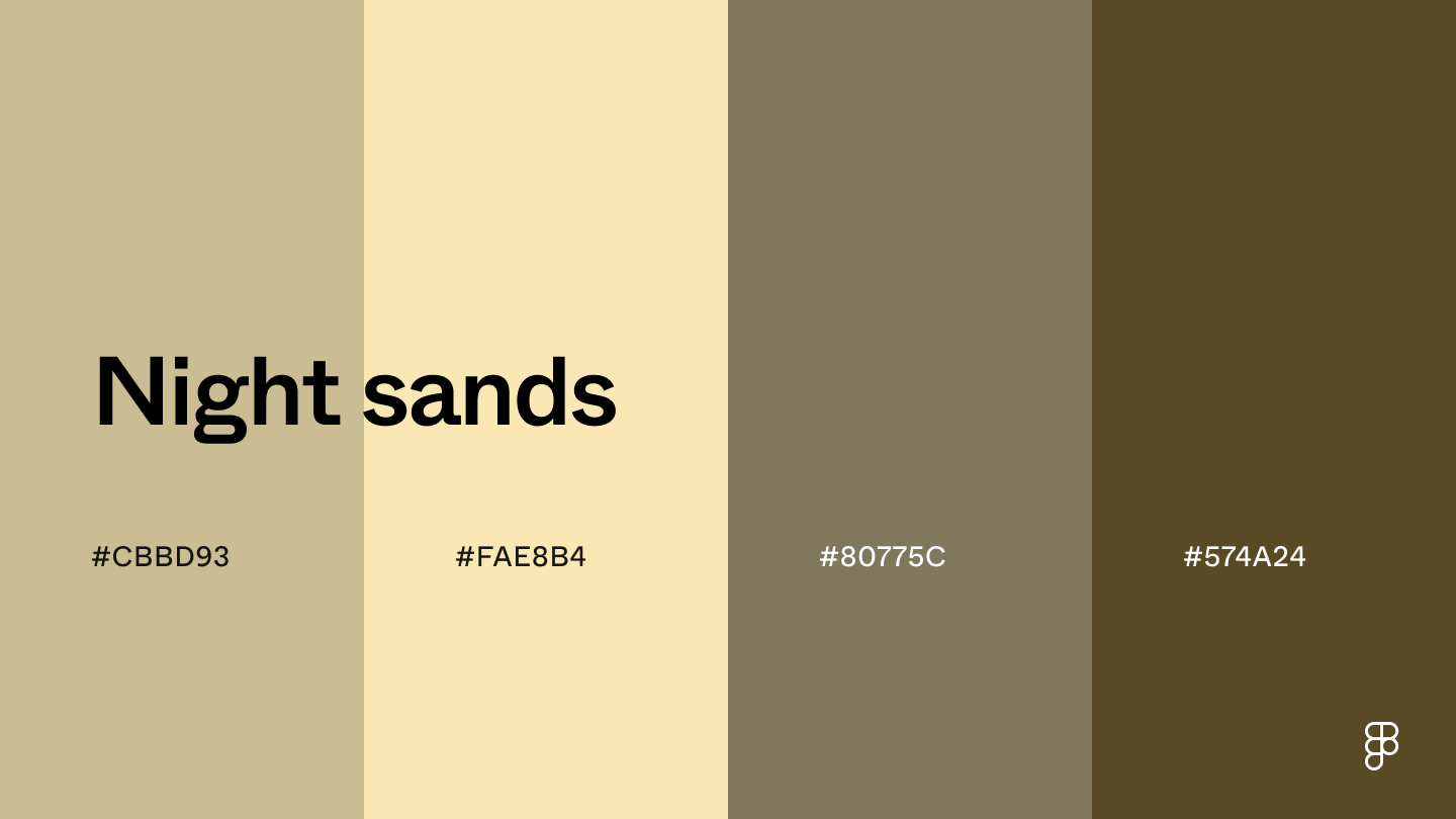
Combination 38: Night sands
This soft color palette is perfect for wedding websites or fashion brands celebrating romance.
Champagne’s yellow and pink undertones evoke elegance, while the muted pink and brown hues give a vintage feel.
This pairing has subtle pops of color while remaining neutral, creating a calming and inviting interface.
Combination 38: Night sands
 This color combination includes warm, natural tones that evoke a sense of stability, reliability, and a connection to nature—great for organic and sustainable brands.
Use sand as the primary background in a UI to create a clean and airy backdrop and dark shades for text and buttons to enhance readability and provide a pleasing contrast.
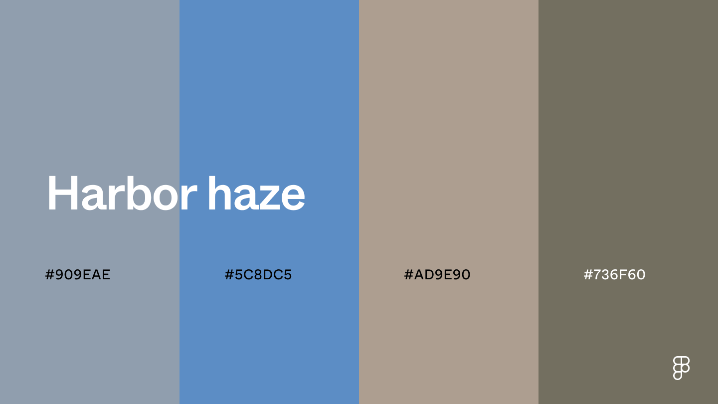
Combination 39: Harbor haze
This color combination includes warm, natural tones that evoke a sense of stability, reliability, and a connection to nature—great for organic and sustainable brands.
Use sand as the primary background in a UI to create a clean and airy backdrop and dark shades for text and buttons to enhance readability and provide a pleasing contrast.
Combination 39: Harbor haze
 This color scheme includes bluish-gray shades like pewter and neutral taupe hues for a calming and professional pairing. In UI design, these colors convey a sense of trust and security—ideal for financial and banking apps or tech companies.
Combination 40: Old photograph
This color scheme includes bluish-gray shades like pewter and neutral taupe hues for a calming and professional pairing. In UI design, these colors convey a sense of trust and security—ideal for financial and banking apps or tech companies.
Combination 40: Old photograph
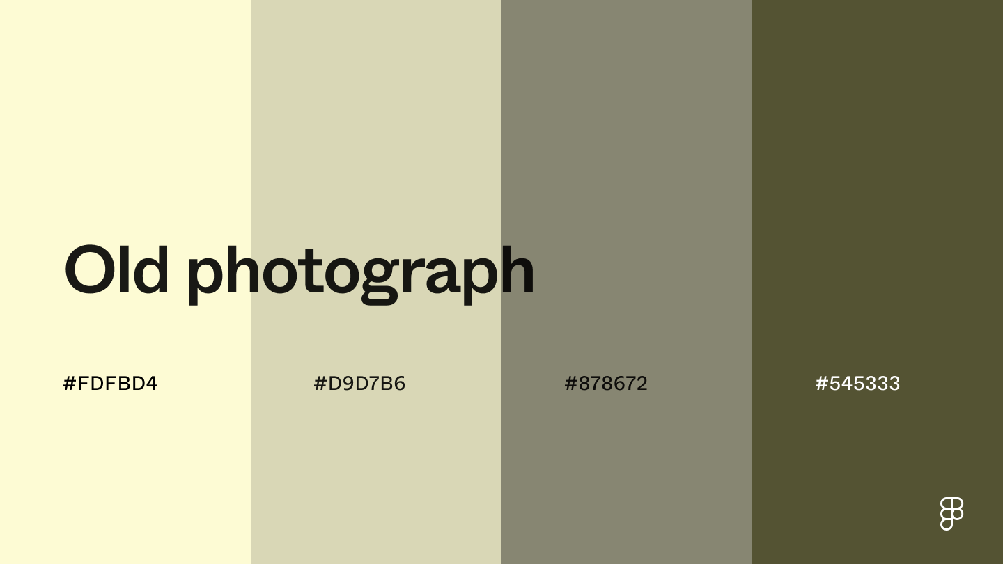 This palette’s cream and mid-tone beige shades create a clean and inviting atmosphere, while the deep olive tone adds a natural touch.
This combination of colors can also evoke comfort and warmth with a touch of luxury—a great vibe for spas, hotels, or travel companies.
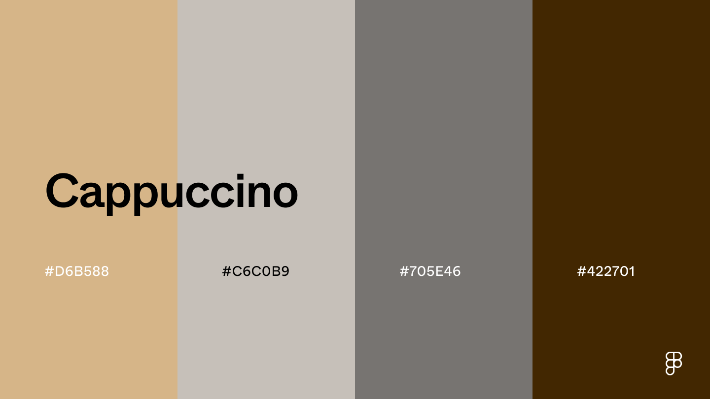
Combination 41: Cappuccino
This palette’s cream and mid-tone beige shades create a clean and inviting atmosphere, while the deep olive tone adds a natural touch.
This combination of colors can also evoke comfort and warmth with a touch of luxury—a great vibe for spas, hotels, or travel companies.
Combination 41: Cappuccino
 This palette’s combination of warm and cool tones creates an inviting and calming vibe.
The tan color offers a clean and soothing background, while the darker shades add a touch of seriousness.
When combined, these shades promote focus and relaxation—a great pairing for productivity or reading apps.
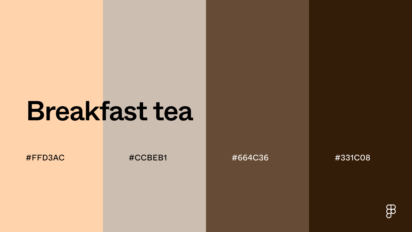
Combination 42: Breakfast tea
This combination features warm, neutral tones to create a sense of sophistication and comfort.
The color peach adds a touch of approachability to prevent the UI from feeling too formal with the dark brown tones.
This palette’s combination of warm and cool tones creates an inviting and calming vibe.
The tan color offers a clean and soothing background, while the darker shades add a touch of seriousness.
When combined, these shades promote focus and relaxation—a great pairing for productivity or reading apps.
Combination 42: Breakfast tea
This combination features warm, neutral tones to create a sense of sophistication and comfort.
The color peach adds a touch of approachability to prevent the UI from feeling too formal with the dark brown tones.
 Combination 43: Cozy campfire
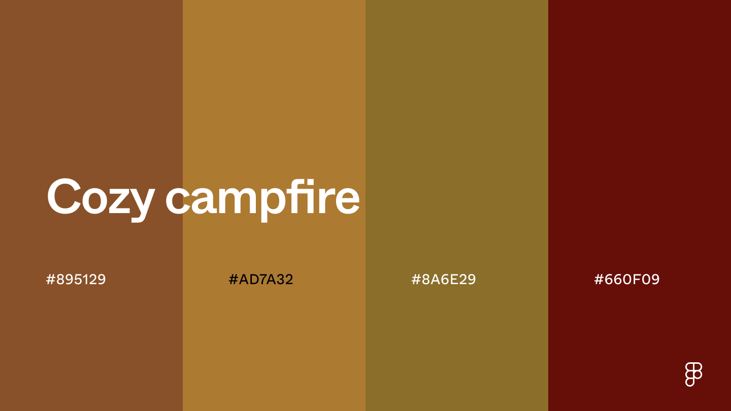 The brown shades in this color combination capture the essence of a cozy campfire, bringing a warm and comforting vibe to user interfaces.
Use the lighter shades for backgrounds and non-critical elements and the darker hues to draw attention to primary buttons and CTAs.
Tranquil color combinations
Bring a sense of peace and relaxation to any UI design with the soft hues and calming tones of these tranquil color palettes.
Combination 44: Charming seaside
The brown shades in this color combination capture the essence of a cozy campfire, bringing a warm and comforting vibe to user interfaces.
Use the lighter shades for backgrounds and non-critical elements and the darker hues to draw attention to primary buttons and CTAs.
Tranquil color combinations
Bring a sense of peace and relaxation to any UI design with the soft hues and calming tones of these tranquil color palettes.
Combination 44: Charming seaside
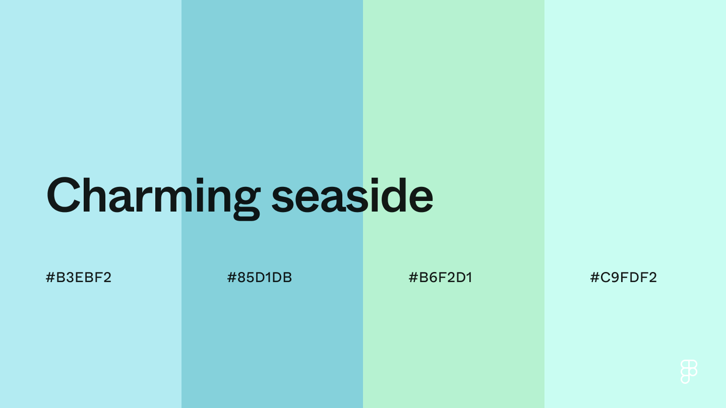 These light and airy colors with slightly different variations create a welcoming and inviting color palette.
Pastel blue brings a calming and approachable effect, while the touch of green evokes a sense of energy and freshness.
Combination 45: Calm blue
These light and airy colors with slightly different variations create a welcoming and inviting color palette.
Pastel blue brings a calming and approachable effect, while the touch of green evokes a sense of energy and freshness.
Combination 45: Calm blue
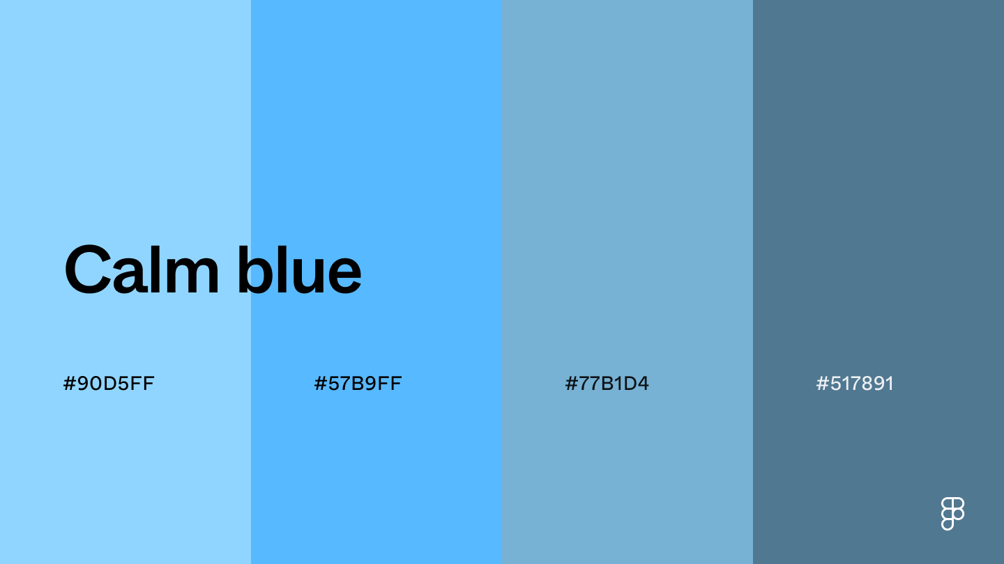 The blue tones in this color palette promote calmness and reliability.
Light blue is a soft shade that creates a relaxing interface, while the muted and dark blue shades offer a touch of seriousness and trust.
Creating a calming and professional atmosphere puts users at ease and encourages a positive experience.
Combination 46: Beachfront views
The blue tones in this color palette promote calmness and reliability.
Light blue is a soft shade that creates a relaxing interface, while the muted and dark blue shades offer a touch of seriousness and trust.
Creating a calming and professional atmosphere puts users at ease and encourages a positive experience.
Combination 46: Beachfront views
 The lavender and dusty blue shades in this color palette add a subtle pop of color to evoke calmness and creativity.
Beige and olive tones tie this pairing together, adding warmth and sophistication to designs.
The colorful hues make UI elements pop while maintaining a sense of calmness, and the deep olive shade provides a pleasing contrast.
Combination 47: Under the moonlight
The lavender and dusty blue shades in this color palette add a subtle pop of color to evoke calmness and creativity.
Beige and olive tones tie this pairing together, adding warmth and sophistication to designs.
The colorful hues make UI elements pop while maintaining a sense of calmness, and the deep olive shade provides a pleasing contrast.
Combination 47: Under the moonlight
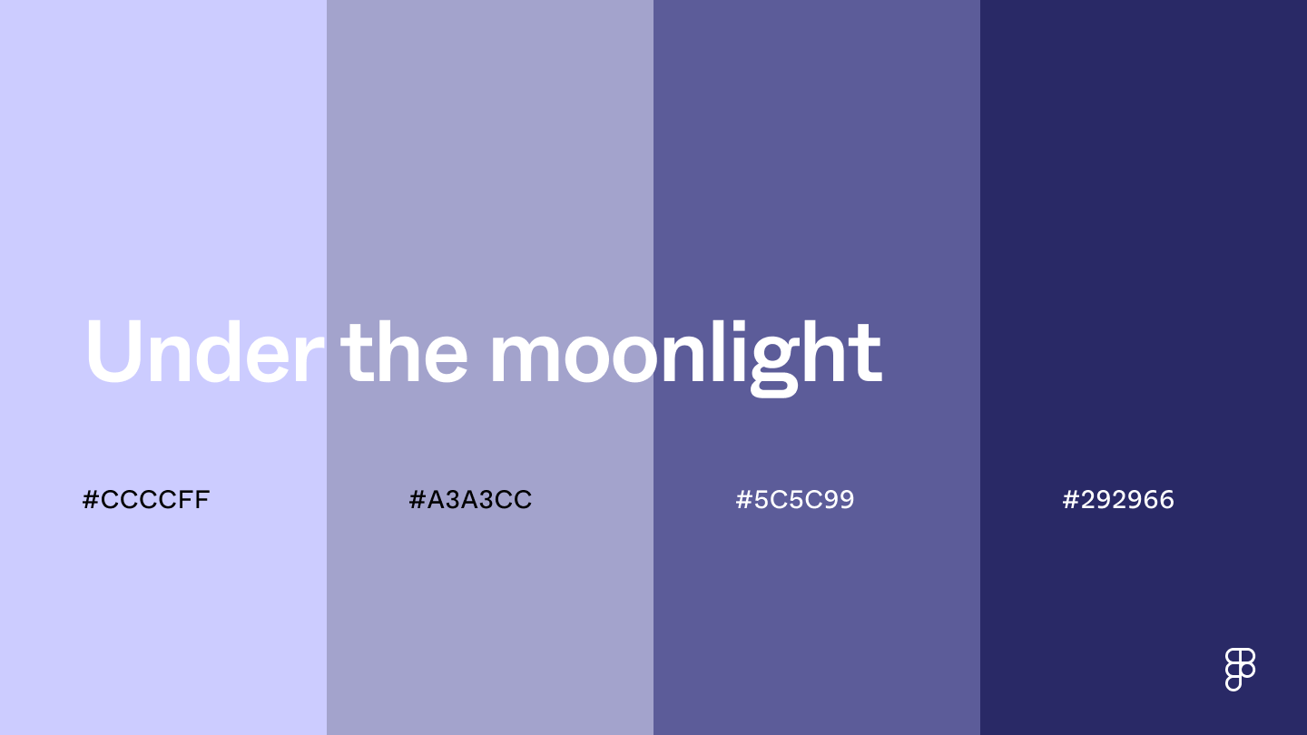 This color combination ranges from periwinkle to deep blue to promote a sense of calmness and wonder.
These hues create a calming and soothing nighttime atmosphere, ideal for sleep and meditation apps.
The connection to curiosity can also inspire exploration, useful for educational content on space and astronomy.
Combination 48: Lavender lullaby
This color combination ranges from periwinkle to deep blue to promote a sense of calmness and wonder.
These hues create a calming and soothing nighttime atmosphere, ideal for sleep and meditation apps.
The connection to curiosity can also inspire exploration, useful for educational content on space and astronomy.
Combination 48: Lavender lullaby
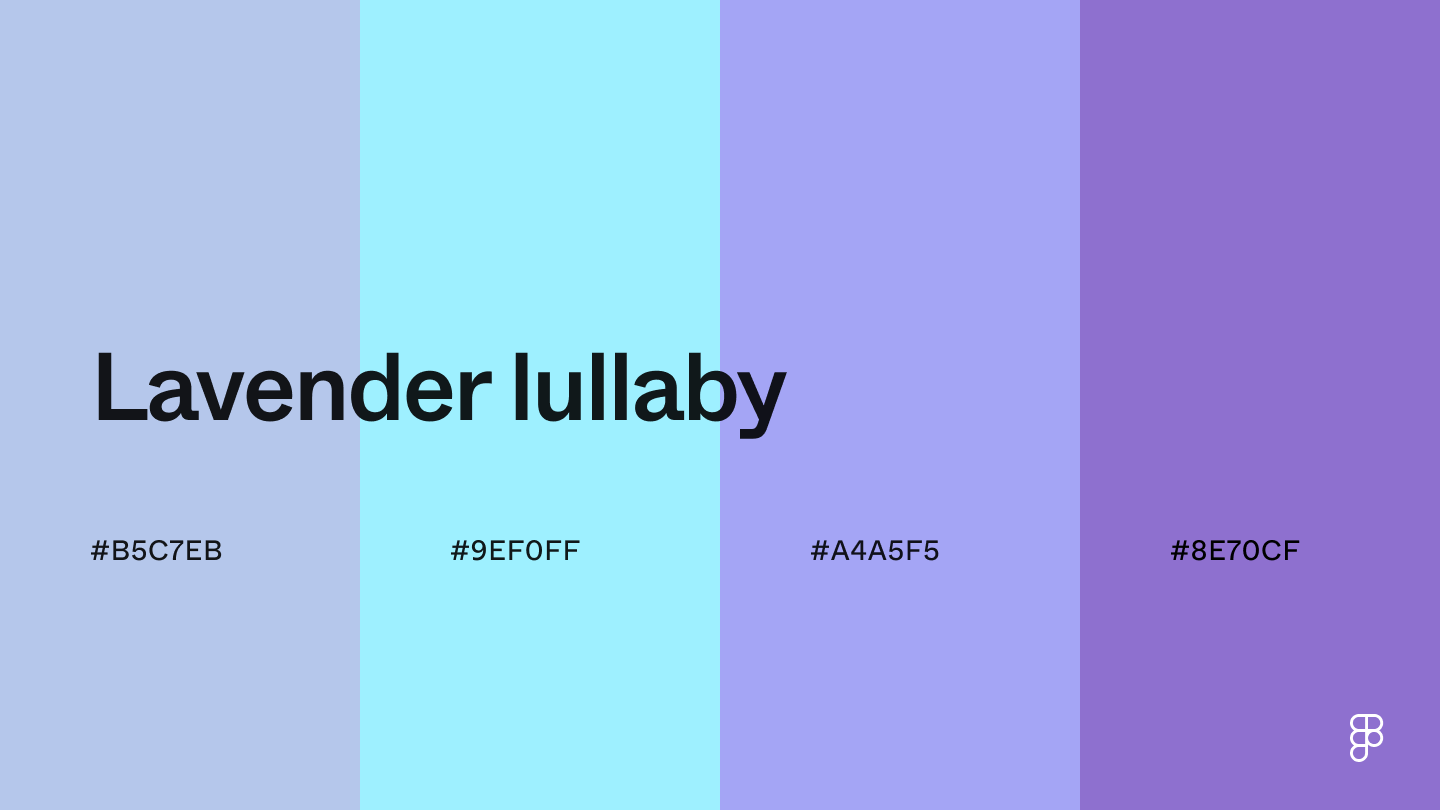 Lavender lullaby makes the perfect palette for sleep apps or soothing soundscapes.
The tranquil misty blue hue creates a sense of peace, while the purple and teal colors maintain the relaxing vibe with gentleness.
Combination 49: Minty fresh
Lavender lullaby makes the perfect palette for sleep apps or soothing soundscapes.
The tranquil misty blue hue creates a sense of peace, while the purple and teal colors maintain the relaxing vibe with gentleness.
Combination 49: Minty fresh
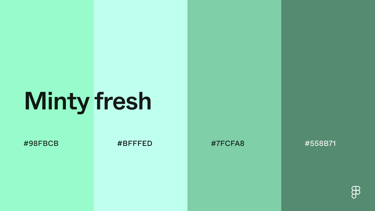 The mint blue and green shades in this color combination bring a refreshing and peaceful energy.
The vibrant yet calming qualities of blue and green are ideal for fitness, health, and wellness apps that want to foster a sense of well-being.
Combination 50: Retro calm
The mint blue and green shades in this color combination bring a refreshing and peaceful energy.
The vibrant yet calming qualities of blue and green are ideal for fitness, health, and wellness apps that want to foster a sense of well-being.
Combination 50: Retro calm
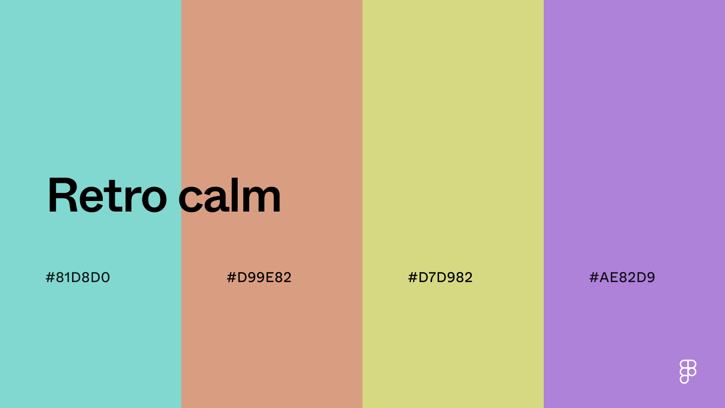 Combining Tiffany Blue, warm muted tones, and lavender creates a sense of calmness and creativity.
Retro Calm’s playful yet soothing hues are suitable for websites or apps focusing on crafts, DIY projects, and artistic hobbies.
Combination 51: Siltstone
Combining Tiffany Blue, warm muted tones, and lavender creates a sense of calmness and creativity.
Retro Calm’s playful yet soothing hues are suitable for websites or apps focusing on crafts, DIY projects, and artistic hobbies.
Combination 51: Siltstone
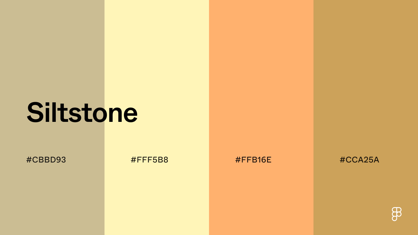 The color sand creates an inviting and comforting foundation, while the cream and light orange shades add energy to this color palette.
Use the lighter tones to create a clean and welcoming background, and the orange shades to make CTAs and important UI elements stand out to capture attention.
Combination 52: Emerald odyssey
The color sand creates an inviting and comforting foundation, while the cream and light orange shades add energy to this color palette.
Use the lighter tones to create a clean and welcoming background, and the orange shades to make CTAs and important UI elements stand out to capture attention.
Combination 52: Emerald odyssey
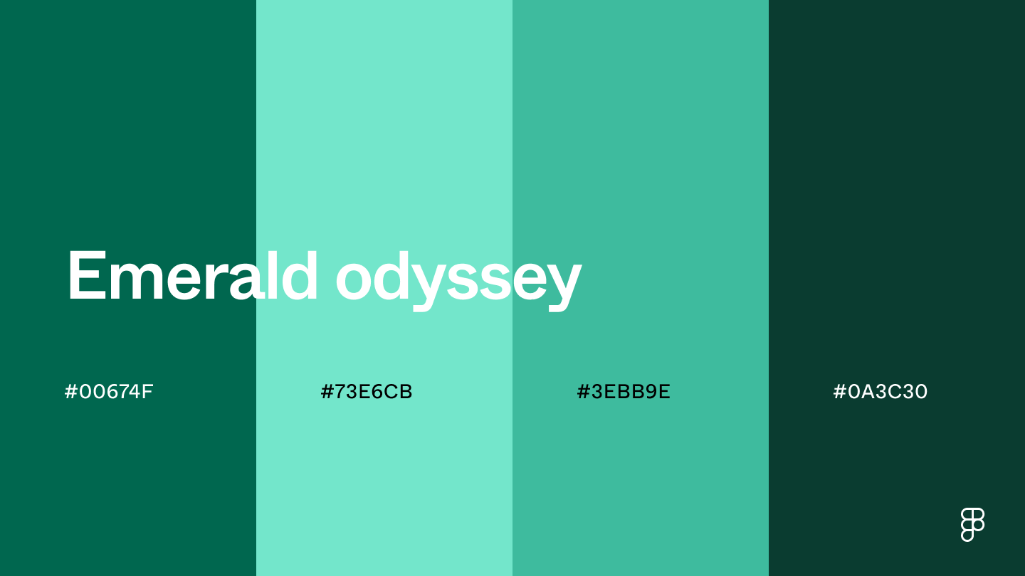 Variations of emerald green bring a calming and natural vibe to this color palette, evoking the feeling of being outdoors.
The connection to nature and growth makes it a great color scheme for landscaping and gardening apps, while green’s relaxing effect also suits wellness and health brands.
Combination 53: Ocean tide
Variations of emerald green bring a calming and natural vibe to this color palette, evoking the feeling of being outdoors.
The connection to nature and growth makes it a great color scheme for landscaping and gardening apps, while green’s relaxing effect also suits wellness and health brands.
Combination 53: Ocean tide
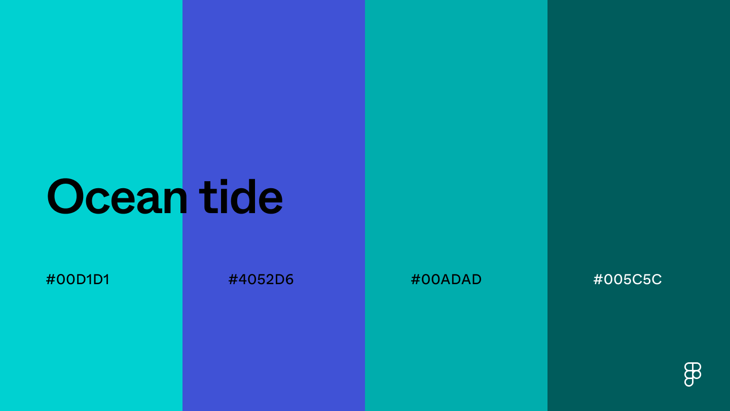 This monochromatic color combination features blue-green hues to capture the essence of ocean waves.
These shades bring a sense of peace and tranquility to UI designs, making them great colors for apps and interfaces that want to convey calm.
Combination 54: Peach skyline
This monochromatic color combination features blue-green hues to capture the essence of ocean waves.
These shades bring a sense of peace and tranquility to UI designs, making them great colors for apps and interfaces that want to convey calm.
Combination 54: Peach skyline
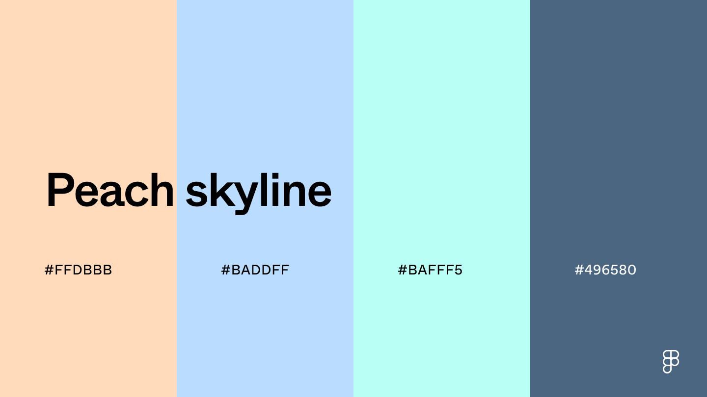 This color combination, which combines light orange and different shades of blue, captures the essence of the skyline at the end of the day.
These soft hues bring warmth and energy to UI designs while maintaining a friendly and inviting atmosphere.
Seasonal color combinations
Dive into the warmth of autumn or the crisp energy of spring with the color combinations inspired by the seasons.
Combination 55: Soft spring
This color combination, which combines light orange and different shades of blue, captures the essence of the skyline at the end of the day.
These soft hues bring warmth and energy to UI designs while maintaining a friendly and inviting atmosphere.
Seasonal color combinations
Dive into the warmth of autumn or the crisp energy of spring with the color combinations inspired by the seasons.
Combination 55: Soft spring
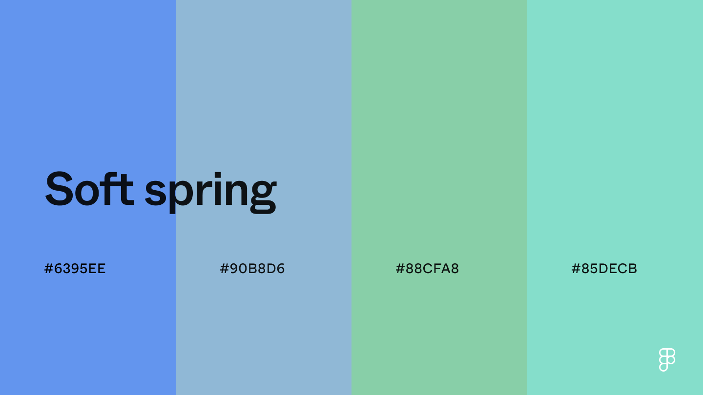 Combining cornflower blue and muted green shades creates a calming and approachable atmosphere, ideal for industries promoting trust and open communication.
Consider using the blue shades as the primary color for a professional feel and the green hues for subtle accents and informative elements.
Combination 56: Autumn leaves
Combining cornflower blue and muted green shades creates a calming and approachable atmosphere, ideal for industries promoting trust and open communication.
Consider using the blue shades as the primary color for a professional feel and the green hues for subtle accents and informative elements.
Combination 56: Autumn leaves
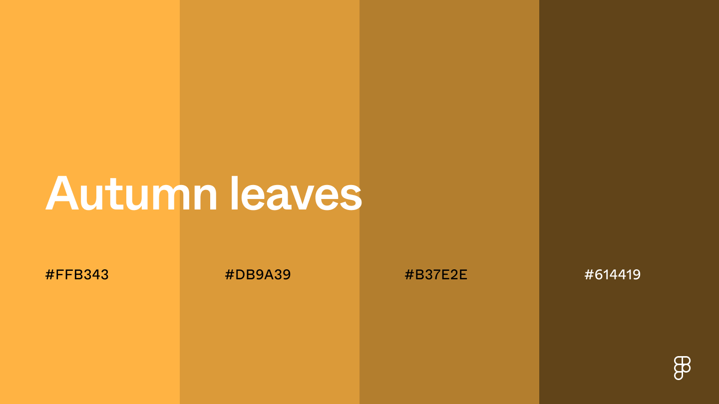 The vibrant energy of yellow-orange paired with the warmth of brown creates a color palette reminiscent of autumn leaves.
Similar to the comfort of the fall season, these colors bring a sense of coziness to UI designs—ideal for travel websites promoting autumn getaways or food and beverage apps serving comfort food.
Combination 57: Winter chill
The vibrant energy of yellow-orange paired with the warmth of brown creates a color palette reminiscent of autumn leaves.
Similar to the comfort of the fall season, these colors bring a sense of coziness to UI designs—ideal for travel websites promoting autumn getaways or food and beverage apps serving comfort food.
Combination 57: Winter chill
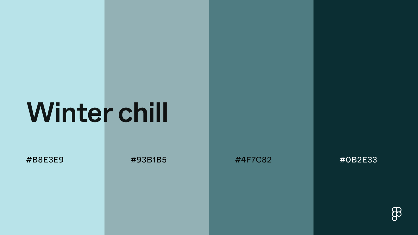 This winter color scheme showcases powder blue and other muted shades to embody the essence of a winter wonderland, bringing festive cheer with a modern spin to designs.
Its cool and icy tones work well for holiday promotions and sales on e-commerce websites or apps promoting seasonal sales.
Combination 58: Spring energy
This winter color scheme showcases powder blue and other muted shades to embody the essence of a winter wonderland, bringing festive cheer with a modern spin to designs.
Its cool and icy tones work well for holiday promotions and sales on e-commerce websites or apps promoting seasonal sales.
Combination 58: Spring energy
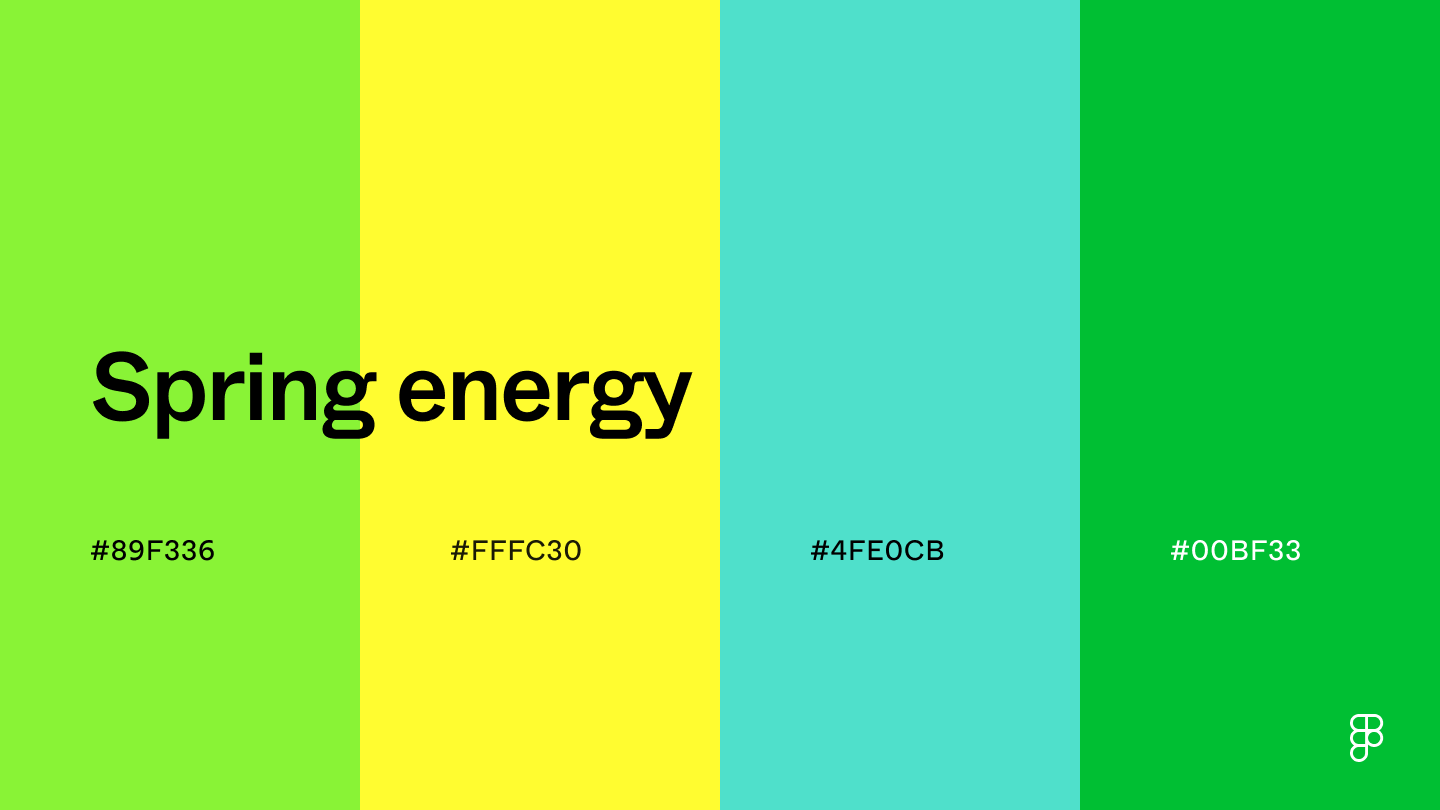 Similar to the fresh foliage of spring, this color palette evokes vibrancy and growth.
Lime green adds a lively feel, representing new beginnings.
The yellow and teal shades create balance and add warmth.
The energetic vibe aligns with wellness and fitness apps, while the growth-oriented qualities make the color scheme ideal for educational platforms targeting a younger audience.
Combination 59: Pumpkin spice season
Similar to the fresh foliage of spring, this color palette evokes vibrancy and growth.
Lime green adds a lively feel, representing new beginnings.
The yellow and teal shades create balance and add warmth.
The energetic vibe aligns with wellness and fitness apps, while the growth-oriented qualities make the color scheme ideal for educational platforms targeting a younger audience.
Combination 59: Pumpkin spice season
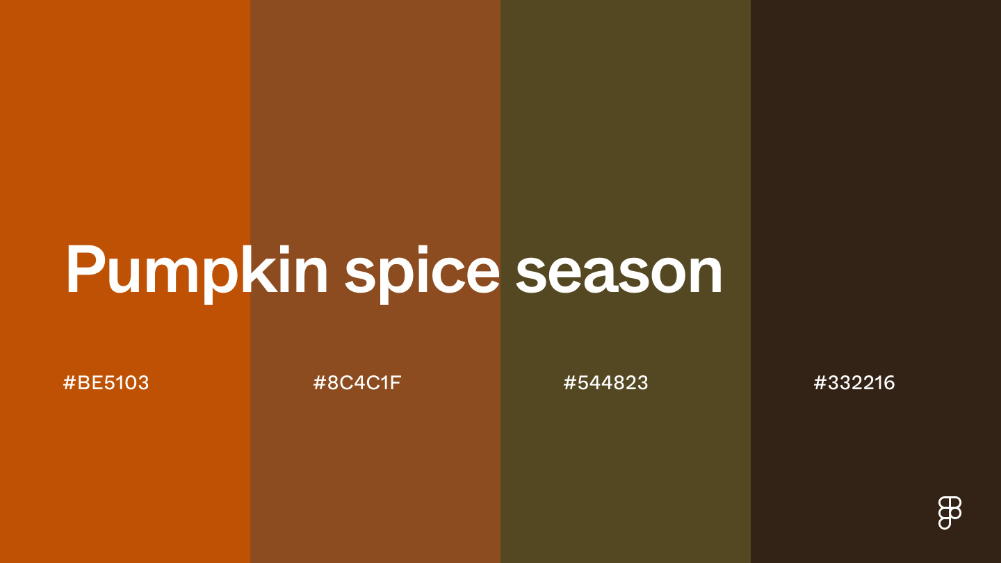 Feel the warmth and comfort of a pumpkin spice latte through this fall-inspired color palette.
The burnt orange and brown tones create a warm and cozy atmosphere that can also convey feelings of trust and sophistication.
Consider tying in lighter neutrals like white or cream for a harmonious and balanced UI.
Combination 60: Island oasis
Feel the warmth and comfort of a pumpkin spice latte through this fall-inspired color palette.
The burnt orange and brown tones create a warm and cozy atmosphere that can also convey feelings of trust and sophistication.
Consider tying in lighter neutrals like white or cream for a harmonious and balanced UI.
Combination 60: Island oasis
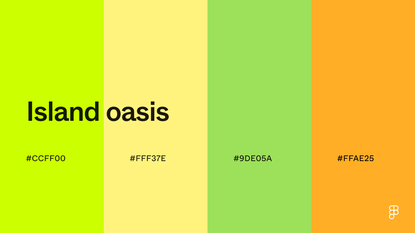 This island oasis color combination transports users to a tropical summer vacation.
The vibrancy of yellow-green and orange, paired with the muted yellow and green shades, creates a sense of tranquility, refreshment, and escape—well suited for travel and leisure apps.
Create impactful color combinations with Figma
Choosing the right color combinations is critical for building a standout interface and defining your brand.
With a good understanding of color theory and strategic design choices, you can create designs that pop.
Here’s how Figma can help:
Explore Figma’s color library to learn the meaning behind colors and how to use them in UI design.
Use Figma’s color wheel to choose a color palette and easily bring it into Figma’s design studio.
Browse color palettes from Figma’s online community to find inspiration for your next design project.
This island oasis color combination transports users to a tropical summer vacation.
The vibrancy of yellow-green and orange, paired with the muted yellow and green shades, creates a sense of tranquility, refreshment, and escape—well suited for travel and leisure apps.
Create impactful color combinations with Figma
Choosing the right color combinations is critical for building a standout interface and defining your brand.
With a good understanding of color theory and strategic design choices, you can create designs that pop.
Here’s how Figma can help:
Explore Figma’s color library to learn the meaning behind colors and how to use them in UI design.
Use Figma’s color wheel to choose a color palette and easily bring it into Figma’s design studio.
Browse color palettes from Figma’s online community to find inspiration for your next design project.
Color Psychology Affect Mood & Emotions
https://londonimageinstitute.com/how-to-empower-yourself-with-color-psychology/
Color can play an important role in conveying information nonverbally, creating certain moods, and even influencing the decisions people make.
What is Color Psychology?
Whether you like a color frequently depends on childhood memories and your association between colors and feelings.
If your mother made you wear yellow one day and your classmates made fun of you, yellow is not likely to be your favorite color as an adult.
Sometimes a hue can have many connotations for you.
For example, you may choose to wear an orange blouse one day because:
It lifts your mood
You are ready to act
You are feeling creative
You want to make a statement
The Meaning of Colors
How do colors affect moods? While perceptions of color are somewhat subjective, some effects have universal meaning.
Colors in the red area of the spectrum can be yellow-based such as scarlet red and red-orange are known as warm colors.
These warm colors evoke emotions ranging from feelings of comfort and warmth to feelings of hostility and anger.
Reds can also have an undertone of blue and are known as cool colors such as burgundy, ruby, raspberry, deep cherry.
These colors are often described as calm but can also call to mind seriousness and dignity.
 The subject is well documented, so we’ll take a look at some personal and professional connotations associated with six of the rainbow colors to give you a better understanding of the psychology of colors.
1. Red
Red attracts the most attention and is associated with strong emotions, such as love, passion, and anger.
It’s the universal color to signify strength, power, courage, and danger.
Red is vibrant, stimulating and exciting with a strong link to sexuality and increased appetites.
Red is energizing and exciting, motivating us to act.
It can also give confidence to those who are shy or lacking in willpower.
It’s warm and positive, generally associated with our most physical needs and our will to survive.
It exudes a strong and powerful masculine energy.
It enhances metabolism, increases respiration rate, and raises blood pressure.
Wear red to energize the group or the meeting but in smaller patches of the outfit, such as a blouse or scarf.
It also does wonders to uplift your mood in a dark green, grey, black and navy basic ensemble.
Red ties are also favored by politicians as part of the red and blue tie partnership they wear with everything.
A little can go a long way, however, and in large areas red can cause visual strain.
Wearing it too much, too often can brand you as a person in charge, but also as a bossy person!
2. Orange
This is the hue of encouragement, optimism, and self-confidence, marking the extrovert.
Orange radiates warmth and happiness, combining the physical energy and stimulation of red with the cheerfulness of yellow.
Orange can inspire courage, enthusiasm, rejuvenation, and vitality.
It can also have a stimulating effect, particularly on the appetite.
It can also be a sign of pessimism and superficiality.
In business applications, orange gives the impression of affordability, depending on the shade chosen and its combination with other colors.
More gentle than red, orange represents more feminine energy and the energy of creation.
For networking or a business social gathering, wear it boldly in a blazer.
Pair it with a coordinating multi-colored top and solid slacks, or more cautiously in small patches in a printed top or scarf.
It also combines naturally and beautifully with the Autumn shades of the Northern US taking on an artistic or grounded feel with brown and spicy shades.
The downside of wearing orange is that orange dye lots vary in quality.
Be sure to check your orange purchase in daylight as the harsher light can downgrade the tone.
Orange ties for men are still on the power list so wear in an expensive silk foulard so that the colors gleam and radiate success.
3. Yellow
Yellow is the color of the mind and the intellect, resonating with the left, logical side of the brain.
It is creative, the tone of new ideas and new ways of doing things.
Post-it notes and legal pads were invented in yellow for a very good reason!
Being the lightest hue of the spectrum, yellow is uplifting and illuminating, offering hope, happiness, and fun.
It’s a warm and happy color that creates a sense of cheerfulness and playfulness, brightening people’s spirits.
However, too much yellow can cause anxiety, nervousness, apprehension, agitation, and confrontation particularly in people who are already stressed.
It can also suggest impatience, criticism, and cowardice, and motivate people to become overly critical, judgmental, and deceitful.
Avoid dressing in yellow when trying to influence men.
They tend to see it as cheap and unsophisticated.
However, it’s brilliant to help stand out from the crowd and can easily be paired with a moderating shade to add more authority such as mid-blue or forest green.
Yellow ties have fallen from the power tie rack recently but can still be worn successfully in a yellow and blue foulard print or polka dot.
4. Green
Green is of nature, of balance and growth.
It is restful and secure, symbolizing harmony, healing, and stability.
It also represents security and self-reliance.
Darker greens relate to money, wealth and prestige, while lighter greens relate to rebirth, growth, and freshness.
However, too much green can lead to feelings of envy, greed, jealousy, and selfishness.
In business, green is beneficial for anything to do with health and healing and promoting natural, safe, organic, environmentally friendly products.
Dark green is a good choice for money and financial websites.
Wear it safely and to your advantage at work, in sales presentations, asking for funding or a loan.
On the lighter side of the green, turquoise and aqua are two of the most popular colors, like the darker teal, all made from varying amounts of blue and green.
They remind one of sunlight on a blue sea, health, peace and abundance.
Use the colors in solids or prints as tops, blouses and shells under pantsuits with camel, beige, taupe as well as purple and charcoal.
Men can wear teal ties to their advantage when they want to look approachable and authoritative.
5. Blue
Blue is the color of trust, serenity, and peace.
It suggests loyalty and integrity as well as conservatism and predictability.
This has the opposite effect on the brain than red.
It is calming, reducing tension and fear, slowing the pulse rate and reducing appetite.
While inspiring wisdom and higher ideals, it is sincere, reserved, and quiet.
Being cool, it creates a sensation of space.
Because blue is the most universally favored color of all, it is the safest to use in business and airline uniforms.
It relates to trust, honesty, and dependability, therefore helping to build customer loyalty.
Blue works well for the corporate world and is often used in important meetings.
Wear it when interviewing, and meeting business professionals such as accountants, insurance companies, bankers and other financial companies where trust and reliability are important.
The downfall of blue and especially navy is that it can seem mature, conservative, boring or denote a rigid outlook.
However, there are many blues that are more exciting than the navy.
Think of a royal or a teal blue that is credible yet more interesting.
Royal blue ties are the politician’s uniform and very predictable.
Great for a conservative audience perhaps.
Vary it a little with a blue or navy suit and white or pale blue shirts.
What about a tie in varying shades of blue with a splash of red!
6. Purple
Purple is the color of imagination and spirituality, inspiring high ideals.
It can be creative and individual or immature and impractical.
It is also an introspective tone, allowing us to connect with our deeper thoughts.
People drawn to purple are usually sensitive and compassionate, understanding and supportive, thinking of others before themselves.
They will often have a peaceful and tranquil quality, with quiet dignity about them.
Purple implies wealth, even royalty, as well as quality, fantasy, and creativity.
This tone heightens people’s sense of beauty and their reaction to more creative ideas.
It is often used to denote a high-quality or superior product.
If you are in a service business, use some purple in your marketing to promote your premium service.
On your next shopping trip look for purple which is a much more creative choice than buying another black jacket.
It’s a good substitute for red and goes well with most pastels to give a high contrast look of authority, without resorting to the black and white cliché.
Wear it with the confidence that you are going to look expensive and creative.
Purple ties and pastel mauve or pinstripe shirts for men are often favored by the more adventurous, creative dressers.
Wear them with confidence if you are representing a creative industry, service or product.
The subject is well documented, so we’ll take a look at some personal and professional connotations associated with six of the rainbow colors to give you a better understanding of the psychology of colors.
1. Red
Red attracts the most attention and is associated with strong emotions, such as love, passion, and anger.
It’s the universal color to signify strength, power, courage, and danger.
Red is vibrant, stimulating and exciting with a strong link to sexuality and increased appetites.
Red is energizing and exciting, motivating us to act.
It can also give confidence to those who are shy or lacking in willpower.
It’s warm and positive, generally associated with our most physical needs and our will to survive.
It exudes a strong and powerful masculine energy.
It enhances metabolism, increases respiration rate, and raises blood pressure.
Wear red to energize the group or the meeting but in smaller patches of the outfit, such as a blouse or scarf.
It also does wonders to uplift your mood in a dark green, grey, black and navy basic ensemble.
Red ties are also favored by politicians as part of the red and blue tie partnership they wear with everything.
A little can go a long way, however, and in large areas red can cause visual strain.
Wearing it too much, too often can brand you as a person in charge, but also as a bossy person!
2. Orange
This is the hue of encouragement, optimism, and self-confidence, marking the extrovert.
Orange radiates warmth and happiness, combining the physical energy and stimulation of red with the cheerfulness of yellow.
Orange can inspire courage, enthusiasm, rejuvenation, and vitality.
It can also have a stimulating effect, particularly on the appetite.
It can also be a sign of pessimism and superficiality.
In business applications, orange gives the impression of affordability, depending on the shade chosen and its combination with other colors.
More gentle than red, orange represents more feminine energy and the energy of creation.
For networking or a business social gathering, wear it boldly in a blazer.
Pair it with a coordinating multi-colored top and solid slacks, or more cautiously in small patches in a printed top or scarf.
It also combines naturally and beautifully with the Autumn shades of the Northern US taking on an artistic or grounded feel with brown and spicy shades.
The downside of wearing orange is that orange dye lots vary in quality.
Be sure to check your orange purchase in daylight as the harsher light can downgrade the tone.
Orange ties for men are still on the power list so wear in an expensive silk foulard so that the colors gleam and radiate success.
3. Yellow
Yellow is the color of the mind and the intellect, resonating with the left, logical side of the brain.
It is creative, the tone of new ideas and new ways of doing things.
Post-it notes and legal pads were invented in yellow for a very good reason!
Being the lightest hue of the spectrum, yellow is uplifting and illuminating, offering hope, happiness, and fun.
It’s a warm and happy color that creates a sense of cheerfulness and playfulness, brightening people’s spirits.
However, too much yellow can cause anxiety, nervousness, apprehension, agitation, and confrontation particularly in people who are already stressed.
It can also suggest impatience, criticism, and cowardice, and motivate people to become overly critical, judgmental, and deceitful.
Avoid dressing in yellow when trying to influence men.
They tend to see it as cheap and unsophisticated.
However, it’s brilliant to help stand out from the crowd and can easily be paired with a moderating shade to add more authority such as mid-blue or forest green.
Yellow ties have fallen from the power tie rack recently but can still be worn successfully in a yellow and blue foulard print or polka dot.
4. Green
Green is of nature, of balance and growth.
It is restful and secure, symbolizing harmony, healing, and stability.
It also represents security and self-reliance.
Darker greens relate to money, wealth and prestige, while lighter greens relate to rebirth, growth, and freshness.
However, too much green can lead to feelings of envy, greed, jealousy, and selfishness.
In business, green is beneficial for anything to do with health and healing and promoting natural, safe, organic, environmentally friendly products.
Dark green is a good choice for money and financial websites.
Wear it safely and to your advantage at work, in sales presentations, asking for funding or a loan.
On the lighter side of the green, turquoise and aqua are two of the most popular colors, like the darker teal, all made from varying amounts of blue and green.
They remind one of sunlight on a blue sea, health, peace and abundance.
Use the colors in solids or prints as tops, blouses and shells under pantsuits with camel, beige, taupe as well as purple and charcoal.
Men can wear teal ties to their advantage when they want to look approachable and authoritative.
5. Blue
Blue is the color of trust, serenity, and peace.
It suggests loyalty and integrity as well as conservatism and predictability.
This has the opposite effect on the brain than red.
It is calming, reducing tension and fear, slowing the pulse rate and reducing appetite.
While inspiring wisdom and higher ideals, it is sincere, reserved, and quiet.
Being cool, it creates a sensation of space.
Because blue is the most universally favored color of all, it is the safest to use in business and airline uniforms.
It relates to trust, honesty, and dependability, therefore helping to build customer loyalty.
Blue works well for the corporate world and is often used in important meetings.
Wear it when interviewing, and meeting business professionals such as accountants, insurance companies, bankers and other financial companies where trust and reliability are important.
The downfall of blue and especially navy is that it can seem mature, conservative, boring or denote a rigid outlook.
However, there are many blues that are more exciting than the navy.
Think of a royal or a teal blue that is credible yet more interesting.
Royal blue ties are the politician’s uniform and very predictable.
Great for a conservative audience perhaps.
Vary it a little with a blue or navy suit and white or pale blue shirts.
What about a tie in varying shades of blue with a splash of red!
6. Purple
Purple is the color of imagination and spirituality, inspiring high ideals.
It can be creative and individual or immature and impractical.
It is also an introspective tone, allowing us to connect with our deeper thoughts.
People drawn to purple are usually sensitive and compassionate, understanding and supportive, thinking of others before themselves.
They will often have a peaceful and tranquil quality, with quiet dignity about them.
Purple implies wealth, even royalty, as well as quality, fantasy, and creativity.
This tone heightens people’s sense of beauty and their reaction to more creative ideas.
It is often used to denote a high-quality or superior product.
If you are in a service business, use some purple in your marketing to promote your premium service.
On your next shopping trip look for purple which is a much more creative choice than buying another black jacket.
It’s a good substitute for red and goes well with most pastels to give a high contrast look of authority, without resorting to the black and white cliché.
Wear it with the confidence that you are going to look expensive and creative.
Purple ties and pastel mauve or pinstripe shirts for men are often favored by the more adventurous, creative dressers.
Wear them with confidence if you are representing a creative industry, service or product.
Final Thoughts on the Psychology of Color
Tone can influence how we feel and act, these effects are subject to personal, cultural, and situational factors.
101 brilliant color combinations
As a designer, it is your job to ensure your product is well-received and successful, and that process often starts with the color pairings you choose.
But how do you choose the right colors? Color, and the emotions they evoke, help us to gain an understanding of what we’re feeling based on whatever we’re looking at.
That is why choosing the correct color palette for your project is an essential step in making any design successful.
Before getting color inspiration from our list of 101 eye-catching color combinations, it’s important to first give a little background on basic color theory.
Color theory is most simply defined as how specific color combinations make us feel — think color psychology.
Remember the color wheel you learned about in elementary school? We’re taking it back to the basics and using that same color wheel to explain fundamental aspects of color theory by demonstrating some essential color combinations you should know.
Core four color combinations
There are many different types of color schemes you can utilize when creating your own design.
However, understanding the core four types of color combinations is an important part of color theory, and a good place to get started when thinking about various color palettes.
Monochromatic
If you want to keep your design simple and clean, consider using a monochromatic color combination.
Monochromatic color schemes are created by using the same color in different shades and tones, such as varied shades of blue.
If you want to keep your color scheme neat and simple, it is hard to go wrong with a monochromatic color combination.

 Analogous
 color combinations are made by choosing a group of 3-5 colors that sit next to each other on the color wheel.
Analogous color combinations are often made up of tertiary colors, which are created when you mix a primary color with a neighboring secondary color (e.g., red-orange or blue-green).
An analogous color palette could consist of different shades of yellow, orange, and red.
Analogous color schemes communicate a linked or united feeling, which can be very visually appealing to your audience.
Complementary
Complementary color schemes are made by choosing colors on opposing sides of the color wheel, like pairing orange with purple.
Complementary color combinations are balanced yet surprising, which communicates a sense of energy and excitement to your audience.
Analogous
Analogous color combinations are made by choosing a group of 3-5 colors that sit next to each other on the color wheel.
Analogous color combinations are often made up of tertiary colors, which are created when you mix a primary color with a neighboring secondary color (e.g., red-orange or blue-green).
An analogous color palette could consist of different shades of yellow, orange, and red.
Analogous color schemes communicate a linked or united feeling, which can be very visually appealing to your audience.
Complementary
Complementary color schemes are made by choosing colors on opposing sides of the color wheel, like pairing orange with purple.
Complementary color combinations are balanced yet surprising, which communicates a sense of energy and excitement to your audience.

 Triadic
 color combinations are made from choosing three colors that are equidistant from each other on the color wheel, thereby creating a triangle.
A triadic color combination could be the pairing of the primary colors: red, blue, and yellow.
Triadic color palettes are visually striking and leave a lasting effect, although it may take some experimentation to find the right three colors or hues that work best for you.
Although we have outlined the four main color combinations, there are many more.
Consider tetradic color combinations, which involves four colors in the form of two complementary color pairs (think about creating a square or rectangle on the color wheel).
Now that you know about basic color theory and the core four types of color combinations, continue for more inspiration from our list of 101 vibrant color combinations.
Muted pastels
Pastels and muted tones have a low hue saturation, meaning they are mixed with white to create softer versions of their brighter counterparts.
Because of this mix, we experience them as understated and soothing.
Think about a soft baby blue or a relaxing shade of teal.
A pastel color palette made up of a few different colors can be used easily for large blocks of color in a design since they are inoffensive and don’t compete with each other for attention.
Try using pastel color combos in your next card or invite creation.
Triadic
Triadic color combinations are made from choosing three colors that are equidistant from each other on the color wheel, thereby creating a triangle.
A triadic color combination could be the pairing of the primary colors: red, blue, and yellow.
Triadic color palettes are visually striking and leave a lasting effect, although it may take some experimentation to find the right three colors or hues that work best for you.
Although we have outlined the four main color combinations, there are many more.
Consider tetradic color combinations, which involves four colors in the form of two complementary color pairs (think about creating a square or rectangle on the color wheel).
Now that you know about basic color theory and the core four types of color combinations, continue for more inspiration from our list of 101 vibrant color combinations.
Muted pastels
Pastels and muted tones have a low hue saturation, meaning they are mixed with white to create softer versions of their brighter counterparts.
Because of this mix, we experience them as understated and soothing.
Think about a soft baby blue or a relaxing shade of teal.
A pastel color palette made up of a few different colors can be used easily for large blocks of color in a design since they are inoffensive and don’t compete with each other for attention.
Try using pastel color combos in your next card or invite creation.
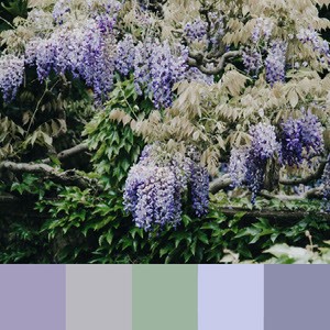
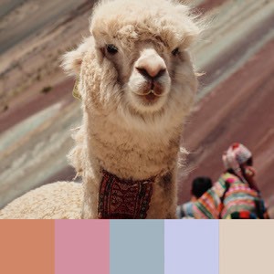
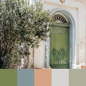
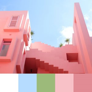
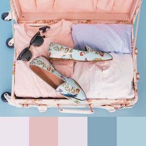
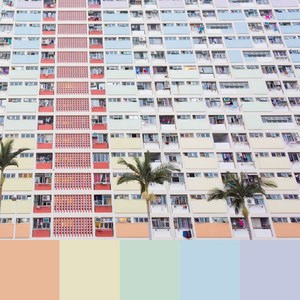 Clean & modern
A muted color paired with a pop of brighter color makes for a modern, clean aesthetic.
Think simple and minimalist graphic design with a little something eye-catching added in.
By keeping a color palette neutral with a singular pop of color, your design will feel light and harmonious while staying bold and impactful.
For example, consider creating a color palette with royal blue as the main event and pairing it with more muted or neutral colors.
These color combinations work well when you want your message to take center stage.
Clean & modern
A muted color paired with a pop of brighter color makes for a modern, clean aesthetic.
Think simple and minimalist graphic design with a little something eye-catching added in.
By keeping a color palette neutral with a singular pop of color, your design will feel light and harmonious while staying bold and impactful.
For example, consider creating a color palette with royal blue as the main event and pairing it with more muted or neutral colors.
These color combinations work well when you want your message to take center stage.
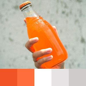
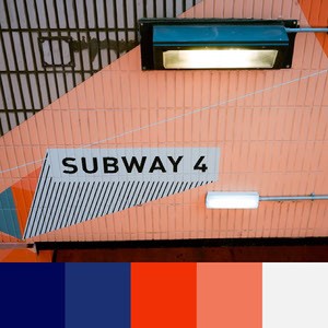
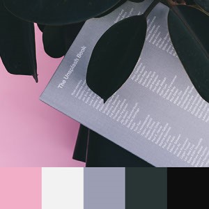
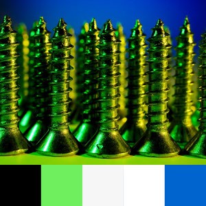
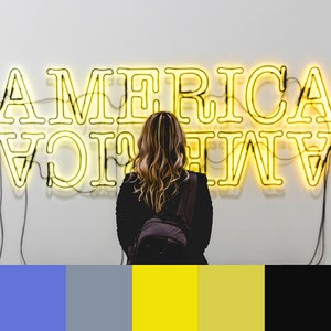
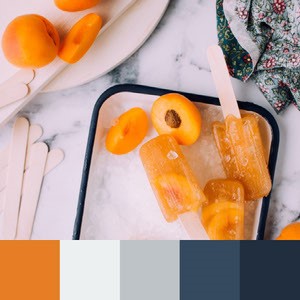
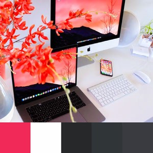
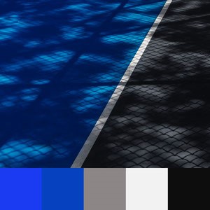
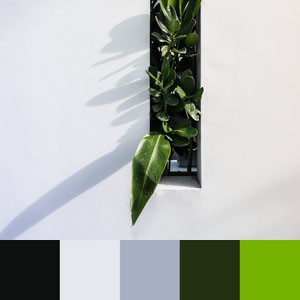 Metallics
Gold and silver — as they are precious metals — have historically been associated with wealth and luxury.
Metallic color schemes can be utilized in multiple ways.
Use variations of metallic tones to work with a full metallic gradient palette in your design.
Or, starting with black or white, add a simple pop of metallic for more minimalist luxury.
Thing about undertones – do you want to create a warm or cool palette? Either way, color harmony is easy when creating a metallic color palette.
This color combo would be excellent for luxe lifestyle brands looking to get noticed using visually rich social media graphics.
Metallics
Gold and silver — as they are precious metals — have historically been associated with wealth and luxury.
Metallic color schemes can be utilized in multiple ways.
Use variations of metallic tones to work with a full metallic gradient palette in your design.
Or, starting with black or white, add a simple pop of metallic for more minimalist luxury.
Thing about undertones – do you want to create a warm or cool palette? Either way, color harmony is easy when creating a metallic color palette.
This color combo would be excellent for luxe lifestyle brands looking to get noticed using visually rich social media graphics.
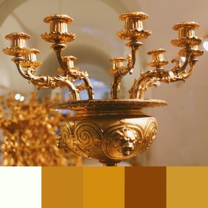
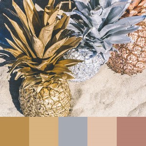
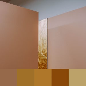
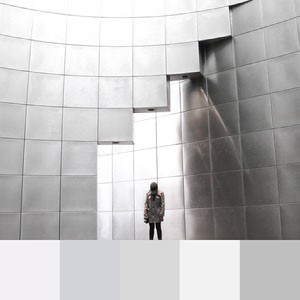
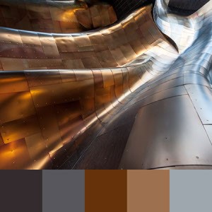
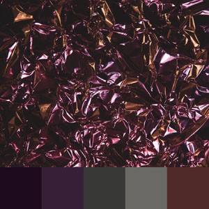
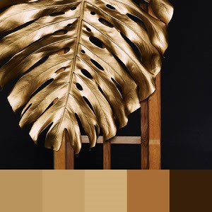
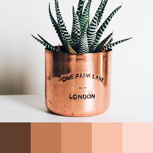
 Bright neons
With everything '90s back in full swing, so too go the neons.
Neons can be incredibly effective in a design as they are instantly eye-catching.
Infuse your designs with energy or brighten up a subdued color palette with a small pop of neon, or whip up a thrill with a full neon rainbow.
Think high-contrast primary and secondary colors.
Use this span of colors in everything from logo design to print products or photography.
These colors are well suited for posters, flyers, or ads.
Bright neons
With everything '90s back in full swing, so too go the neons.
Neons can be incredibly effective in a design as they are instantly eye-catching.
Infuse your designs with energy or brighten up a subdued color palette with a small pop of neon, or whip up a thrill with a full neon rainbow.
Think high-contrast primary and secondary colors.
Use this span of colors in everything from logo design to print products or photography.
These colors are well suited for posters, flyers, or ads.
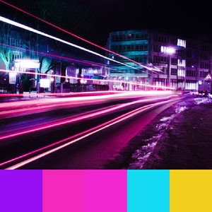
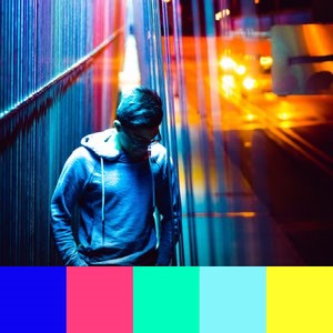
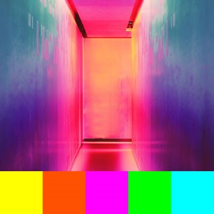
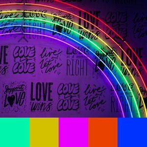

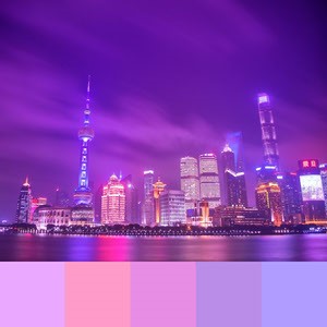
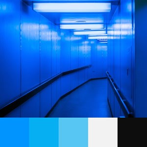
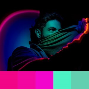
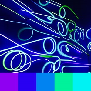 Duotone/monochromatic
Traditionally known as a photo effect, duotone is where two contrasting colors are superimposed on a black and white photo, replacing the black and white gradient with colors.
For example, a bright yellow and dark pink palette would replace the highlights (yellow), midtones (orangey pink) and shadows (dark pink) of the photo, thereby creating a two-color version of the photo.
For smoothed-out color palette ideas, look no further than duotone gradients.
Monochromatic color schemes draw on variations of the same color to create harmonious color combinations.
Consider a blue monochromatic color scheme that ranges from royal blue to teal with a few tints in between.
What fun projects can you come up with that utilize these two-color looks?
Duotone/monochromatic
Traditionally known as a photo effect, duotone is where two contrasting colors are superimposed on a black and white photo, replacing the black and white gradient with colors.
For example, a bright yellow and dark pink palette would replace the highlights (yellow), midtones (orangey pink) and shadows (dark pink) of the photo, thereby creating a two-color version of the photo.
For smoothed-out color palette ideas, look no further than duotone gradients.
Monochromatic color schemes draw on variations of the same color to create harmonious color combinations.
Consider a blue monochromatic color scheme that ranges from royal blue to teal with a few tints in between.
What fun projects can you come up with that utilize these two-color looks?
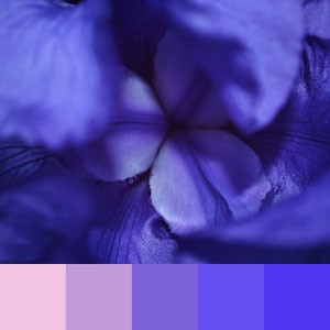
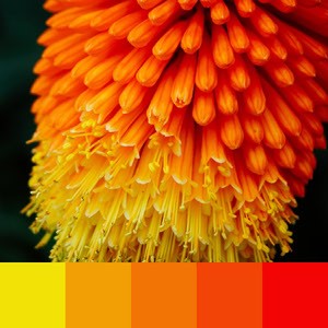
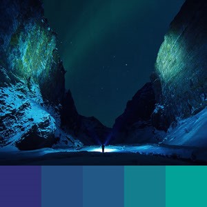
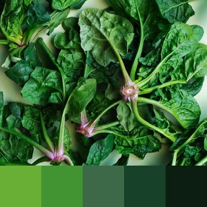
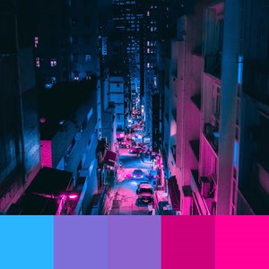
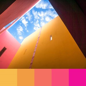
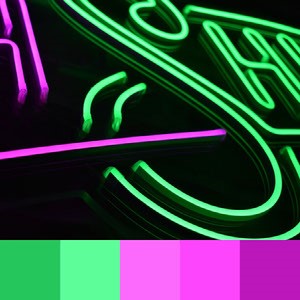

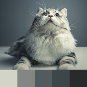 Natural & earthy
Nature has inspired art since the beginning of time.
Our natural environment is rich with diverse organic color palettes — think of the neutral warm colors of a desert, the light blue of the sky on a clear morning, or the powerful spread of a stunning red-orange sunrise.
Colors like forest green and vivid sky blue remind us that there are gorgeous colors all around us.
Try grounding your next design with one of these color schemes brought to you by the universe (and the team at Adobe Express).
These color combos would work well for brands aiming to evoke calm and natural vibes, like a health and wellness blog, or social posts for an organic goods brand.
Natural & earthy
Nature has inspired art since the beginning of time.
Our natural environment is rich with diverse organic color palettes — think of the neutral warm colors of a desert, the light blue of the sky on a clear morning, or the powerful spread of a stunning red-orange sunrise.
Colors like forest green and vivid sky blue remind us that there are gorgeous colors all around us.
Try grounding your next design with one of these color schemes brought to you by the universe (and the team at Adobe Express).
These color combos would work well for brands aiming to evoke calm and natural vibes, like a health and wellness blog, or social posts for an organic goods brand.
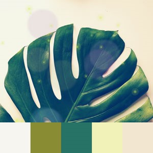
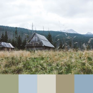

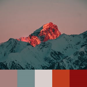
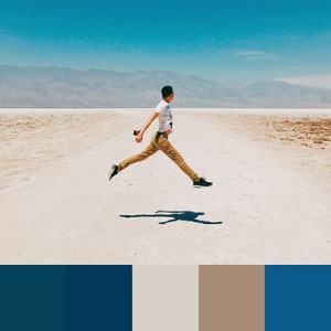
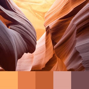
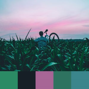

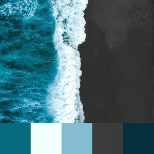 Retro style
Retro color palettes are reminiscent of vintage cars, fabric prints, and home decor.
Transform the feel of your design and rewind the clock by using these nostalgic tones.
Think about throwback color palettes utilizing yellow-greens and powder blues.
Utilize these color combinations for photo filters, to create vintage patterns, update your branding, or just have fun and play around.
Retro color combos are well suited for cards, posters, or trendy social posts.
Retro style
Retro color palettes are reminiscent of vintage cars, fabric prints, and home decor.
Transform the feel of your design and rewind the clock by using these nostalgic tones.
Think about throwback color palettes utilizing yellow-greens and powder blues.
Utilize these color combinations for photo filters, to create vintage patterns, update your branding, or just have fun and play around.
Retro color combos are well suited for cards, posters, or trendy social posts.
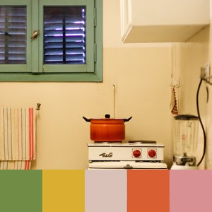
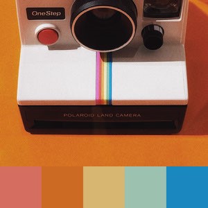
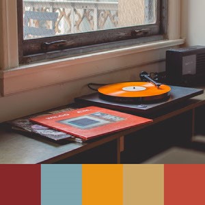
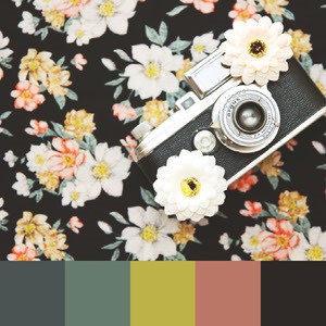
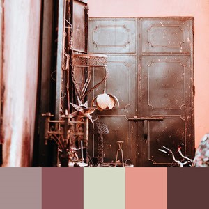
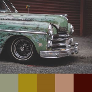
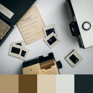
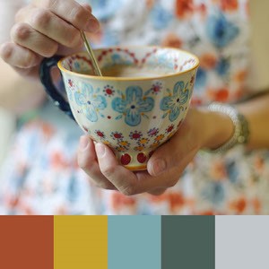
 Bold & modern
A common trend in graphic and web design is to create contrast and drama by using a dark yet neutral color, such as black or grey, for a background color and combining it with one or more bold accent colors, like a duchsia or royal blue.
These color palettes are dynamic, vibrant, and punchy.
They set the tone for your brand, and that tone is fearless.
Bright colors can be used in large floods or minimally as accents.
Bold & modern
A common trend in graphic and web design is to create contrast and drama by using a dark yet neutral color, such as black or grey, for a background color and combining it with one or more bold accent colors, like a duchsia or royal blue.
These color palettes are dynamic, vibrant, and punchy.
They set the tone for your brand, and that tone is fearless.
Bright colors can be used in large floods or minimally as accents.
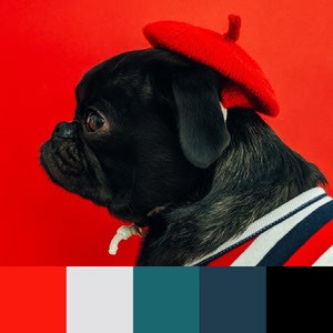
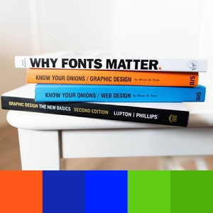
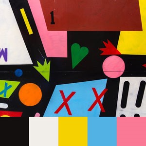
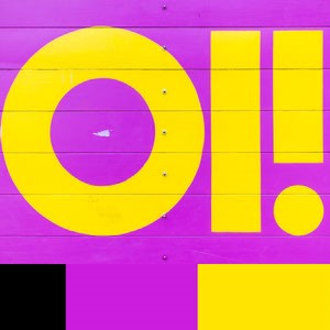
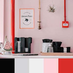
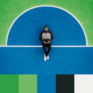
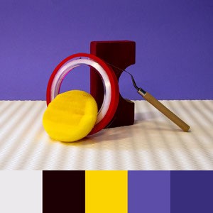
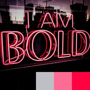
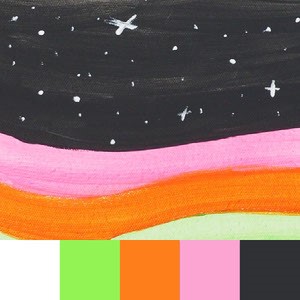 '90s throwback
The '90s are known for two distinct pop cultural styles:
1. Bright jewel-toned palettes, as seen in Fresh Prince of Bel Air, Beverly Hills 90210, or Clueless.
These colors – such as cyan, hot pink, electric blue, lime green, or magenta – communicate a fun, approachable, and playful demeanor; try using them for your next Snapchat or Instagram story.
2. Grungy, moody, more neutral color palettes, as seen in Daria, Twin Peaks, or early Friends episodes.
These muted color combos are a great way to subtly throwback to that great decade while keeping your design subtle.
How about layering some distressed icons on your design to add to the grunge aesthetic?
'90s throwback
The '90s are known for two distinct pop cultural styles:
1. Bright jewel-toned palettes, as seen in Fresh Prince of Bel Air, Beverly Hills 90210, or Clueless.
These colors – such as cyan, hot pink, electric blue, lime green, or magenta – communicate a fun, approachable, and playful demeanor; try using them for your next Snapchat or Instagram story.
2. Grungy, moody, more neutral color palettes, as seen in Daria, Twin Peaks, or early Friends episodes.
These muted color combos are a great way to subtly throwback to that great decade while keeping your design subtle.
How about layering some distressed icons on your design to add to the grunge aesthetic?
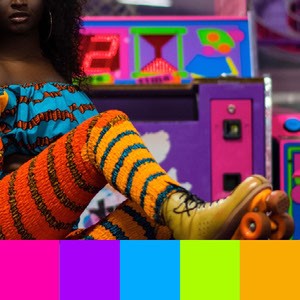
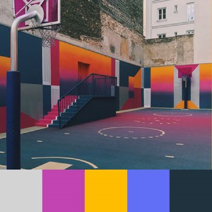
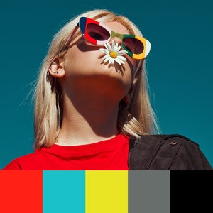
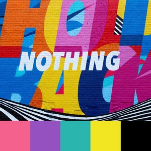
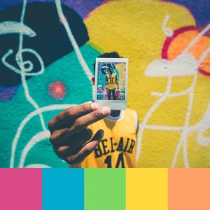
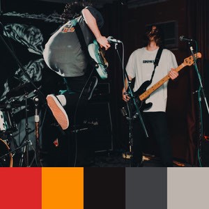
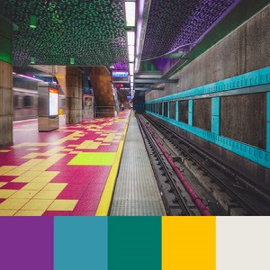
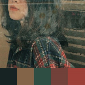
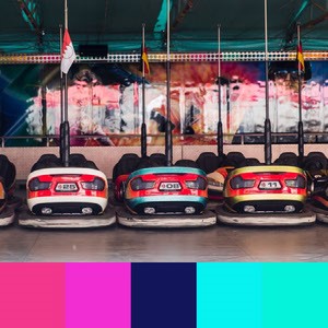 Moody & gothic
Think hunter green, mauve, navy and dark blues, blue-greens, and dusty pinks — deep jewel tones mixed with charcoal blacks — the kind of color schemes that would be at home in a Bronte novel or somewhere in the Pacific Northwest.
Give your design gravitas or moodiness with these rich color palettes.
These color combos would work well for event invites or social posts.
Moody & gothic
Think hunter green, mauve, navy and dark blues, blue-greens, and dusty pinks — deep jewel tones mixed with charcoal blacks — the kind of color schemes that would be at home in a Bronte novel or somewhere in the Pacific Northwest.
Give your design gravitas or moodiness with these rich color palettes.
These color combos would work well for event invites or social posts.
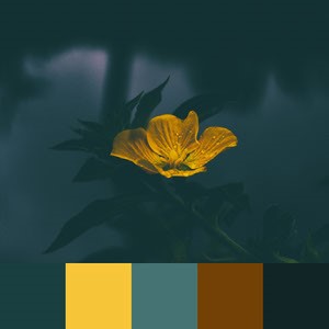
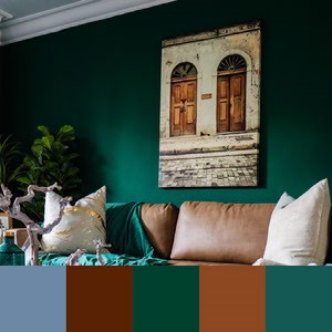

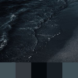
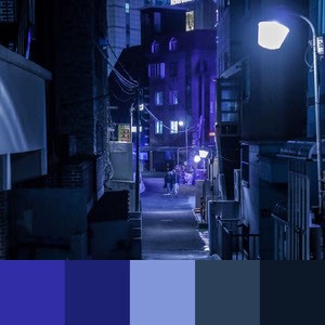
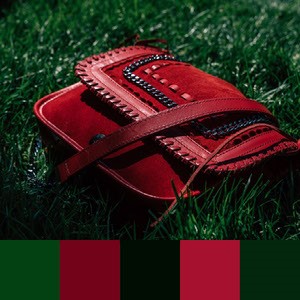
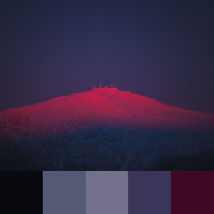

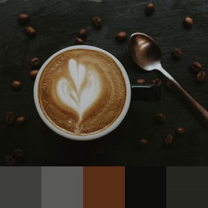 Multifaceted neutrals
Neutral colors, like shades of greys, tans, and browns, are versatile and pair well together.
However, to make your color schemes a little more interesting, consider pairing neutral tones with subtle pops of cool colors.
Color combinations of neutral shades and hues with low chroma — think muted or minimized saturation — can have either a upscale and modern feel or leave a more down-to-earth and comfortable impression.
Multifaceted neutrals
Neutral colors, like shades of greys, tans, and browns, are versatile and pair well together.
However, to make your color schemes a little more interesting, consider pairing neutral tones with subtle pops of cool colors.
Color combinations of neutral shades and hues with low chroma — think muted or minimized saturation — can have either a upscale and modern feel or leave a more down-to-earth and comfortable impression.
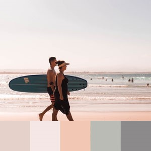
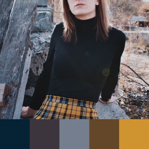
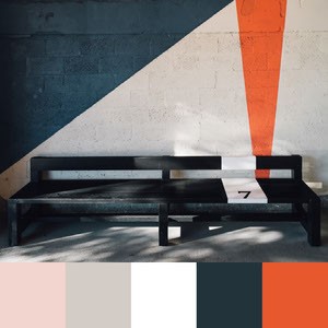
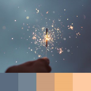
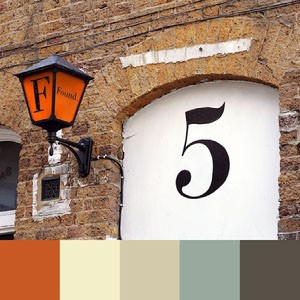
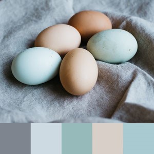
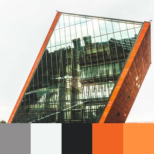
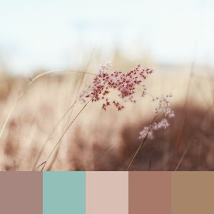
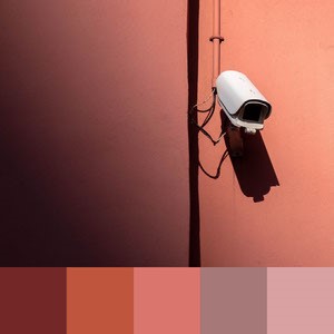 Use a color palette generator
Can’t find your perfect color palette anywhere on this list? Try out the Adobe Express color palette generator for free.
Create versatile color combinations for interior design projects, brand colors, and beyond.
We hope that these 101 color combinations have inspired you for your next project.
When looking to design anything — whether that be a logo, banner, flyer, social media post, advertisement, or anything else you can think of — look no further than Adobe Express.
How to get creative with color in Adobe Express
Browse Intelligent Palettes
Adobe Express’ smart color algorithm can instantly hook you up with intelligent palettes, based on the content you start with.
To try it out, open Adobe Express on the web or mobile.
Create a new project, starting with a photo.
Pick one from your camera roll or try searching the free photo or Adobe Stock library.
Adobe Express will auto-generate palettes that work well with your photo so when you add text, shapes, or other design elements, you know you're working with colors that go well together.
Easily tap through our options to transform your design in a single tap.
Adjust Hues with Color Strips
Once you’ve landed on a palette, you can refine further using the color strips that appear when you choose “Customize.” The top gradient strip refers to the color, while the bottom allows you to find the perfect shade by tweaking according to saturation and pigment.
Move the strips until you land on the perfect shade.
The hex value will automatically appear just below your chosen hue.
Choose Color from the Background Image
Achieve ultimate text-to-image cohesion by matching text color to a color from your background, using Adobe Express color picker.
Choose "colors" from the editor to open the color swatches.
Choose the color swatch you want to customize and then move the eyedropper symbol anywhere on your image to instantly find and match the color.
Apply a Specific Hex Value
Hex values are how we identify and name digital colors.
If you have your heart set on a specific shade, get a perfect match by selecting the hex value for that shade.
From the custom colors view, you can copy and paste the code in the bottom box or scroll through hex values.
Use a color palette generator
Can’t find your perfect color palette anywhere on this list? Try out the Adobe Express color palette generator for free.
Create versatile color combinations for interior design projects, brand colors, and beyond.
We hope that these 101 color combinations have inspired you for your next project.
When looking to design anything — whether that be a logo, banner, flyer, social media post, advertisement, or anything else you can think of — look no further than Adobe Express.
How to get creative with color in Adobe Express
Browse Intelligent Palettes
Adobe Express’ smart color algorithm can instantly hook you up with intelligent palettes, based on the content you start with.
To try it out, open Adobe Express on the web or mobile.
Create a new project, starting with a photo.
Pick one from your camera roll or try searching the free photo or Adobe Stock library.
Adobe Express will auto-generate palettes that work well with your photo so when you add text, shapes, or other design elements, you know you're working with colors that go well together.
Easily tap through our options to transform your design in a single tap.
Adjust Hues with Color Strips
Once you’ve landed on a palette, you can refine further using the color strips that appear when you choose “Customize.” The top gradient strip refers to the color, while the bottom allows you to find the perfect shade by tweaking according to saturation and pigment.
Move the strips until you land on the perfect shade.
The hex value will automatically appear just below your chosen hue.
Choose Color from the Background Image
Achieve ultimate text-to-image cohesion by matching text color to a color from your background, using Adobe Express color picker.
Choose "colors" from the editor to open the color swatches.
Choose the color swatch you want to customize and then move the eyedropper symbol anywhere on your image to instantly find and match the color.
Apply a Specific Hex Value
Hex values are how we identify and name digital colors.
If you have your heart set on a specific shade, get a perfect match by selecting the hex value for that shade.
From the custom colors view, you can copy and paste the code in the bottom box or scroll through hex values.